Forum Replies Created
-
AuthorPosts
-
Hi Raven,
For the paper I’m not actually suggesting the 140lbs watercolor paper, although depending on the company that could be good paper. The advantage of stretching is that you could use relatively thin paper and get similar results. You’ll have to experiment, but from my experience, any paper can be stretched. I would recommend The Strathmore Mixed Media. It’s a good thickness and relatively smooth.
As for proportions, basically, all I can say is stick with it and you’ll see yourself improve in that department. In a sense, I don’t teach them directly, we don’t count heads, or remember ratios because I think that’s all needlessly confusing and most often impossible to apply correctly. That said, knowing those things is helpful and you can find that in many good books. Paul Richer is my go to for proportions. But, that said, the whole measuring of angles exercises, is in fact a way to get proportions. Later, when we draw boxes for the rib cage and pelvis, the proportions of the boxes themselves are discussed, as well as the spaces between them. That’s how I teach proportions, and I think it works. Let me know!
Yes, I regularly visit the forums and comment on work so I’ll look forward to seeing yours.
In the course, one drawing is done on the 18×24 board, but I recommend you do at least 2-3 more portraits before moving on from the NMA reference library.
Hope this helps!
Best,
Iliya
Hi guys!
Ok so let me address all of your questions.
1. Paula, the weight of the paper does make a difference, and it is true that really heavy paper, like 140 lbs watercolor paper can withstand a lot more water without buckling. That said, almost all paper will and stretching totally eliminates that problem, because if it does buckle, it’ll just re-stretch as it dries, plus it gives you a nice solid and sturdy surface to work on.
2. Laurie, the sizes of the panels I use are 18×24 for the portrait, 24×48 for the figure and then a much larger panel for the double figure. Basically, a 16×20 or 18×24 is perfect for the portrait and any panel which is 2 squares in height ( length is twice the width) will work for the standing (and even upright sitting) figure.
3. Becca, the panels are completely reusable. All you have to do is carefully cut out the drawing along it’s perimeter and remove the paper still left on the sides (I would remove the staples every 2-3 stretches). The cheapest option would actually be to make one yourself. It doesn’t take a lot handywork, as you can go to Home Depot or Lowe’s and have them cut the Masonite and 1×2’s to size. but either way, it’s an investment, because as I said, they last.
4. Raven, the size of the roll of paper only needs to be about 3-5 inches wider than the width of your panel and I’ve seen many different rolls.
I hope this helps. Feel free to post more questions and I’ll get to them as soon as I can. Thank you so much for investing your time in my course, it really means a lot to hear about your positive experience (but don’t hold back on the negatives either as we’re always looking to make things better!)
Best Regards,
Iliya
Hi Marjolein,
Good job working on these nice gestural poses. I sketched a little draw-over pointing out some errors in your contours and why they would be in a different place based on the large fundamental anatomical structures, the rib cage and pelvis.
Keep up the great work!
Iliya

Hi Peter,
I really like this drawing, and its particular attention to structure. The torso is well drawn and I’m really digging the delicate handling in the halftones. I think the drawing itself would read more “finished” if the lower legs were a little more structured, less “wavy” and drawn with light but more solid lines. I would be careful with particular poses such as this one where the pit of the neck, and the arms are obscured (the left arm in this case.) The reason for this is that in such poses, the limbs (and head) tend to look disconnected from the torso and this is particularly difficult to overcome in a drawing (from both an anatomical and a compositional standpoint.) I must say though, you’re doing a good job with it.
The head could use just the slightest bit more work, it feels too “underdrawn” in relation to the rest of the figure.
Overall, really great work!
Best,
Iliya
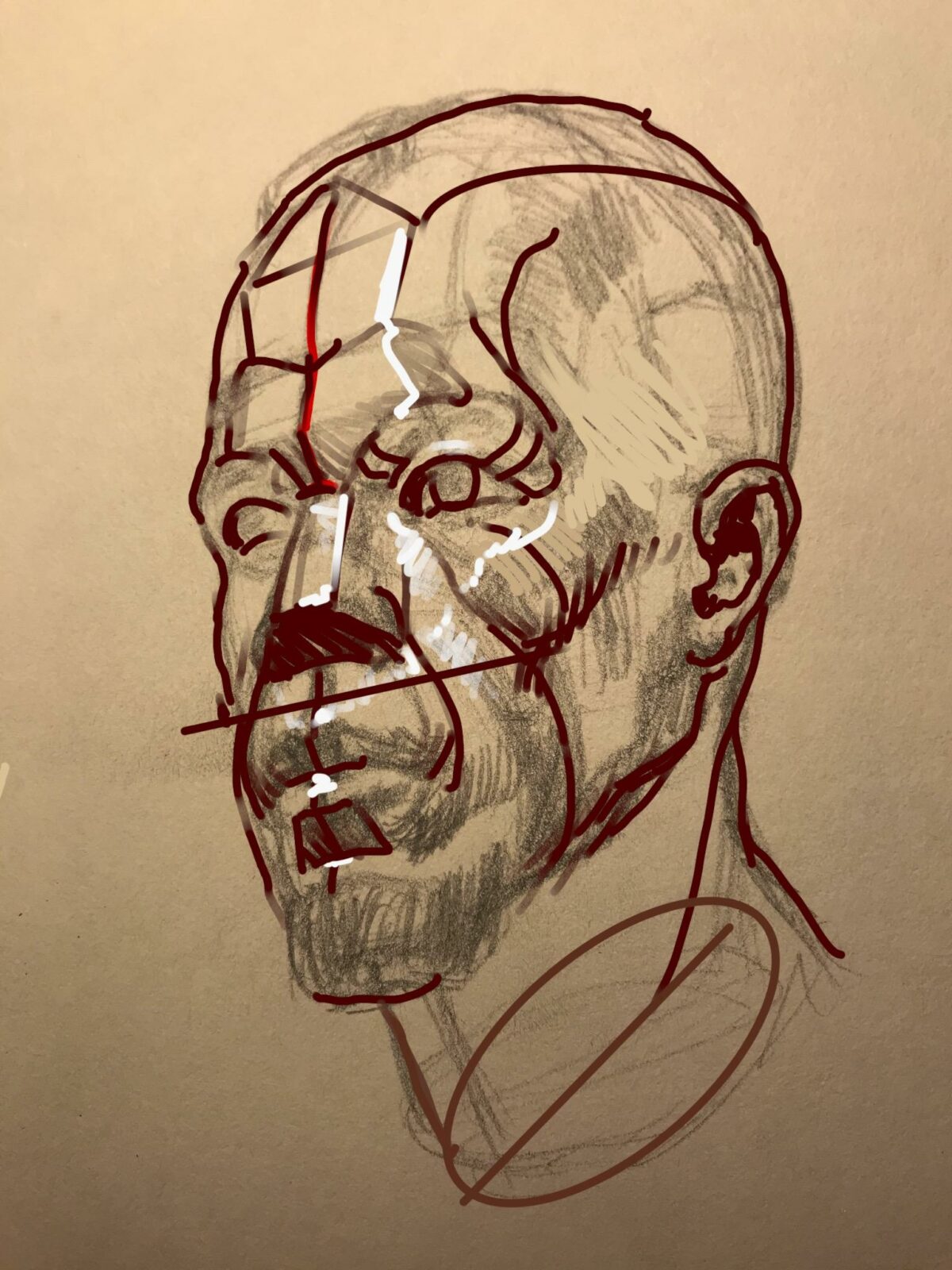
Hey Myriam,
I really like that you’re spending time learning the structures of the face and Rasmus Aagaard has some really good schematics. I did a draw over making some corrections. My structures might not correspond one to one to his analysis but I think the corrections are still valid. Keep the center line in mind as well as don’t forget to capture the roundness of the zygomatic bones.
Keep up the great work!
Iliya

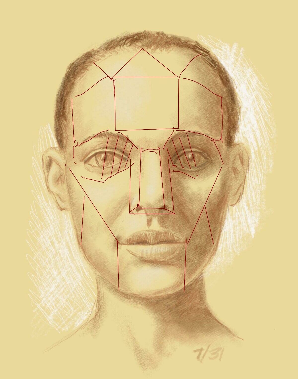
Hi Sherman,
I did 2 draw overs, one showing the planes of the head and then another showing what a basic distribution of values according to those planes would look like. I think the proportions in this most recent portrait are good, it’s just the forms that we need to work on. I’ll be checking in and will probably be drawing individual draw-overs for the features of the face.
Good luck and keep up the good work!
Iliya
Hi Paul,
I like this little landscape sketch. I made a draw-over with a couple of things that I thought would add more atmosphere and variation.
Best,
Iliya
 July 31, 2020 at 4:48 pm in reply to: Ian’s 100-Day Art Challenge: Faces, People, and Places #651346
Hi Ian,
I really like all the stuff you’ve got here, it’s quite a variety, and I’m always a fan when different media is used to achieve similar effects. It helps create a base of fundamentals that apply to all media. I’m working on something like this right now. I do want to comment on this most recent portrait you posted.
Firstly, I think that it would’ve been a little bit more complex of a color relationship if it wasn’t so complementary, the orange is contrasting too heavily with the blue I think.
As for the structure, I think it’s fundamentally important to treat the eye as a socket first and then build the eye into it, with all of it’s component parts laying on top of the spherical form. You are showing the structures very clearly in the skulls above but here they’re a little hazy.
I think the hair on the left side could’ve been lighter as it would work better with general light on the head.
And, personally, I feel that more information could’ve appeared in the lit cheek. This would’ve totally flipped some accents (which would then need to be readjusted) but it would emphasize the underlying anatomical structures a bit better.
And my final recommendation is to not paint the open mouth so dark, it begins to take on too much attention and distracts from more important areas.
Other than that, I think this is a good study!
Keep up the great work!
Iliya


Hi Beth,
Sculpting portraits is, in my opinion, one of the greatest experiences. I’m so glad you’re doing it. The one thing I’d recommend is to look more at the profile view. The face feels flat, and regardless of ethnicity it’s rarely as flat as what I’m seeing here. Plus, I’ve seen this kind of error many times in my classes. So try to work more from the profile and 3/4 view than the front view, and remember that the face wraps around the head further back. I’ve done 2 draw-overs, one showing the planes of the face, and the other is an attempt at correction. What I mean by that is I drew some lighter and darker areas as I would if I were correcting a drawing or a painting, indicating the form better. Basically, you need to pay attention to the lights and shadows on the sculpture because they are describing the form. This is why sculpture is so good, it really does make your drawings and paintings better.
Keep up the good work!
Iliya
July 30, 2020 at 4:48 pm in reply to: Elena’s 100 Day Challenge : Figure and anatomy drawing #649547Hi Elena,
Keep up the great work on all this anatomy. I totally agree that some of the quick studies are a good way to practice the essential elements and forms of the skull. I did a draw over making corrections to your most recent post. I would recommend doing some of them in a strictly structural way, without the details at all. The Gottfried Bammes anatomy book is a good place to look.
I’ll be checking in!
Best,
Iliya

Hi Erik,
I really like this last drawing you posted from Glenn’s invented light lesson. I think it’s very strong, especially in the areas where the foreshortening is most obvious like the legs and left arm (our left). I know Glenn has a way of really bringing light into the areas of shadow to define the forms better and give a real sense of atmosphere, but he doesn’t repeat values too much inside of those shadows area. I think that’s something to consider when modeling in the shadows. Make sure your terminators are prominent and ease up on the values as you model further into the core shadows. In a lot of areas in your drawing, the terminators are missing altogether. Just in case “terminator” is not a word used in the lessons, it’s basically the edge of the core shadow closest to the light.
I do also think it’s important to establish the shoulder girdle, the elliptical origin of the neck at the first rib and then plant the head on top of that. Also, an easy proportional thing to keep in mind is to look at your drawing, and compare the 2 legs to each other, and the 2 arms to each other, and make sure they’re proportionally similar.
I’ll be checking in! Keep up the good work.
Best,
Iliya
Hi Gordan,
It’s me again! I started doing the perspective draw – over but felt I needed to try to pull the sketch from the previous post together. I agree with you that it’s particularly difficult to keep the tonal structure of a landscape sketch that’s so overburdened with trees, shadows, foreground, background, all of that. And the hard part is having to hit that perfect equilibrium between making sure the values read clearly, while expressing that kind of difficult, convoluted tonal structure present in such scenes. I did a draw-over where I grouped things a bit more, made sure that the foreground read a little darker, but also grouped sections of the background as well. The middle ground I left pretty much as is, with a little darkening of the ground plane. It’s easier for me, for sure, because I just adjusted them as I felt like it, since I don’t see the reference. But, that’s something you might want to try to do. Draw from life, but then finish from memory.
Hope this helps!
Best,
Iliya

-
AuthorPosts


CONNECT
New Masters Academy
16182 Gothard St
Huntington Beach, CA 92647
Contact US