- Lesson Details
- Transcript
- Instructor
- Steve Huston
- Subjects
- Painting
- Topics
- Light & Color
- Mediums
- Brush, Canvas, Oil Paints
- Duration
- 1h 9m 35s
- Series
- Light and Shadow Theory for Painters
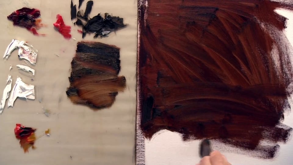
In this video lesson world-renowned painter Steve Huston will teach you an approach for dealing with light and shadow in painting known as the the Rub Out technique. You will begin by creating a toned canvas and then you will remove paint to create half tones and highlights that are lighter than the tone and darken areas that should be in shadow.
Materials
- Gamblin Artist Grade Oil Colors
- Simply Simmons Paintbrush
- Canvas Panel
Beginner Friendly
8025 views
46 likes
Discuss this video in the forums!
DiscussChoose one video.
AUTO SCROLL
In this video lesson, world-renowned painter Steve Huston will teach you an approach for
dealing with light and shadow with painting known as the rub-out technique.
You will begin by creating a toned canvas and then you will remove paint to create half-tones
and highlights that are lighter than the tone and darken areas that should be in shadow.
This technique is a staple of the professional painter and can be used easily alongside other
painting approaches.
AUTO SCROLL
In this particular session, we’re going to take our rub-out technique and show you
a couple of different variations, take it a little bit further and show you in a slower
manner the process to render.
I’m going to mix up, and you can see my old beat-up brush that I used to scrub in
a mid-size canvas.
For a really big canvas, I’ll get a big house paint brush from the hardware store.
But for these mid-size or small canvases, I’ll use this.
Most of the time I do a ground on my painting.
If I’m working from life—oftentimes, I won’t, but especially if I’m working in
a brighter Impressionist palette oftentimes I won’t.
Or, I’ll rub in and tone the canvas with a brighter color, a bright rich kind of sunshine
orange or something like that for the flesh.
I’m scrubbing this in.
I’m not putting any solvent in the paint.
It’s nice and dry because I want it to be dry and sticky when I do the rub-out.
If it’s wet and loose it’s going to flow all over the place, and then I lose control.
Alright, so we will leave it at that.
Now I’m going to take a paper towel and I’m going to rub it in and slightly spread
it out, but we just need this little vignetted area to do what we need to do.
I end up with a nice, dark tone.
The color doesn’t matter.
You can experiment with any color.
Like I said, sometimes an Impressionist painting, if I have a figure in the studio working from
life, I’ll put in a nice bright color as a background just to have that luminosity,
that kick of color for the rich flesh, the warm flesh.
It can be any color.
But don’t experiment with bright colors at first.
Use the earth tones.
Something that is kind of a non-color, a brown.
It could be a little richer orange.
It could be green or umber, anywhere in there.
If it gets really bright then you start to feel the intensity, and you don’t feel the
shadow.
Shadows are kind of noncolors because they are the absence of light.
They, of course, have a reflected light and all that kind of juicy stuff that happens
in the outdoor arena, but for the most part you want to think of shadows as the absence
of light and make them fairly gray.
The same would go for drawing.
If you’re drawing in a drawing class, don’t get a bright piece of paper to draw on, and
don’t get bright colored pencils, CarbOthello or Prismacolor pencils to draw with because
those bright colors when you lay those in for the shadows or when they sneak through
your pencil and show in the shadows, it’s going to look intense.
It’s going to throw you.
You won’t see the cohesion of the shadows.
Alright, so there is my very careful drawing.
I’m kidding.
Just my simple drawing with a light source coming from this direction.
Always know your light source.
Now we are going to begin a rub-out.
Now, whenever I do an environment, a figure in light and shadow,
a foreground with a background,
as opposed to sketching, say drawing a face on a page and you don’t worry about the
background.
Whenever I have that foreground/background relationship, that light and shadow relationship,
I’m going to design this in three values.
I’m going to have a light value, a dark value, and a middle value.
The light source is going to tell you a lot about what should be what, but there are choices
you can make about it too.
You can make the middle value the shadows and the foreground.
You can make the background the middle value and make the shadows the dark value in the
foreground any way you want to do it.
And you can make it a really contrasting painting from white to black, or it can be a subtle
painting from mid-light to mid-dark.
We will, of course, be starting in a subtler, with a subtler painting look to it.
As we start to rub it this will get subtly lighter against the mid-range dark.
Now, all I’m doing is I’m wiping off, and I switch to a clean part of my rag or
paper towel in this case.
As I rub it off the canvas, it’s rubbing onto the tool,
and you can see how dark it gets.
It loads up that paper towel, and we can’t get any more off.
And so we do it again.
Again, this technique is great.
If you’re not comfortable with paint, if you’ve always drawn and rendered in pencil
and Prismacolor, things like that.
This is a great introduction to that because it’s really like drawing with a kneaded
eraser.
You’re lifting away the tones off your page.
Again, load it up.
It rubs away.
You can see how I slowly get into a value range that’s close to what I want.
It gets very hard to get all the way back to white.
You can add turpentine here, but the problem with adding turpentine is it’s going to
get wetter and start to get looser, so we have to be careful how we do that.
Alright, now we have an egg on a tabletop.
In this case, the egg and the tabletop happen to be the same value.
The light of the egg is going to bump right into the light of the tabletop,
this part of the egg.
You can see how we can get this moody kind of sophisticated look right off the bat.
If I goof up that shadow, little corner of the shadow in the egg, I’ll fix that later
with a more refined tool, one of my brushes.
I’m getting the broad strokes out here.
Again, if you look at—I mentioned this in the other lectures or lecture, both of them;
go look at the American illustrators.
Their heyday was the 80s and 80s, 70s, 80s, and 90s.
They started before that, at least Bernie Fuchs did.
The style I’m talking about is their 80s style.
Look at Bernie Fuchs and David Grove.
They were the two top rub-out artists of the day.
Their technique was exactly this, and you could see how they did it.
David Grove was more straightforward realism, but he did quite a few movie posters and stuff,
and so he put in bright colors, but the technique was pretty straightforward drawing,
straightforward realism.
Bernie Fuchs was much more stylized.
He came from an earlier era of more design, with an influence by Bonnard and Vuillard,
the style of American illustration.
It had kind of a high-fashion sense to it, and it had a more graphic quality.
There are a lot of shapes, and some of these were with a lot of little shapes, but all
rubbed out and a little more graphic.
David Grove would get that rendering of light dropping into shadow.
Bernie Fuchs not as much, but you could see the lovely design.
He did a lot of sports and baseball things, so you can see the stripes of the costume
of the baseball players as he’s going for the catch, that kind of thing.
But both of those fellows are terrific to look at to give you a basic idea of what you
can do with your rub-out technique.
Then the other artist I mentioned was a favorite of Rodin, the sculptor Auguste Rodin
and that’s Eugene Carriere.
Again, I’m not sure of the pronunciation on that.
Okay, so that quick we’ve established our basic value system.
I’ve got this in a two-value system at the moment, and that would be fine to do.
I’m going to smooth out this shadow a little bit.
You can see how fuzzy the edges are of our cast shadow here.
That’s fine to do to get that kind of fuzzy look to it.
It can add kind of a softening, a flaring of the shadows, where the shadow of the egg.
The shadow of the background maybe will lose that too.
You can see by losing the silhouettes where things come together, where the egg shadow
meets the tabletop shadow, it all gets lost together.
Where the egg meets the background it all gets lost together.
We have these lines that we put in for our drawing.
We can leave those or we can lose them, or we can play them down a little bit as I’m
doing here.
Maybe we will push this darker.
You can see how quickly we can establish a really excellent tonal pattern.
Notice that my dark values—I’m going to lay this in—could get a little darker, especially
in the egg in the background, but even in the front edge of this tabletop.
It could get a little darker and in some places a lot darker.
The light of the egg and the light of the tabletop, of course, could get much, much
darker too.
I mean, much, much lighter also.
And so as we start rendering this, we’re going to render it into a more contrasting,
more extremes of value to get more and more pop.
Now we absolutely wouldn’t have to do that.
We could say I love this soft mid-range and Carriere would work in just this area.
He wouldn’t take it much farther.
You might put a little slightly lighter half-tone or highlight on it, but that's it.
We can take this farther.
When you’re doing any medium it’s important to have a process.
You’re technique.
The process is important that it supports the idea.
In my world, shadows are dark ideas.
When I start rendering the shadow, I want to render it darker and darker and darker.
If it start out designing the shadow so it’s just dark enough, and then start putting in
light reflected light into it, it’s going to start to look lighter and lighter and lighter,
and this value shadow will start to look similar to this value of half-tone.
Likewise, if I just left the white egg as a white canvas, that would seem to be less
work, and it would be less work to do it that way.
Then what would happen, though, is I’d have this white chunk of egg in the light side,
and then I’d start adding darker half-tones.
I’d go darker and darker and darker.
What happens to us if we’re not careful, and it almost always happens to us even if
when we are careful.
When we start rendering in the wrong direction, we start adding darker values to the thing
that we want to be light, and we start adding lighter values to the thing that we want to
be dark.
It gets screwed up.
We want a process that supports our goal.
Our goal is to make these shadows dark ideas and these light surfaces light ideas.
So we’re going to have a process where we’re going to make the light side ever lighter
and the shadow side ever darker.
Then at the very end, yeah, we might need to add a little darker half-tone
on the light side.
We might need to add a little bit of reflected light on the dark side, but overall it’s
going to give us a really nice supportive process.
We don’t have to worry over it.
If we’re doing things backwards, then we have to worry, did I go too far or did I go
too far?
Did I forget to check and we got in trouble?
AUTO SCROLL
Alright, now, we can take this further by taking some turpentine, a little bit of solvent.
I’m using Gamsol.
It’s an odorless solvent.
We can start rubbing away.
You can see that kind of lovely glowing yellow-white there.
And you can see how every time I take a little paint off, I rub it away on my paper towel.
You can see this is a fairly slow, methodical process, especially if we have a big surface
like this to deal with.
We’ll just do a little section like this.
The thing I like about this, especially for beginners is that it is slow.
Notice also here the little watermark edge.
When we start pushing our paint off the surface, we’re picking some of the paint up on the
brush and we’re pushing, shoveling the rest of the pigment in front of us like a snow shovel.
When we do that we get a watermark edge like we would in watercolor.
You put down the little blob of color and the water seeps out and thickens at the edge,
draws the pigment out.
When it dries you get a slight darkening and intensifying of that color at the edge of
the watermark.
We’re getting that effect here as it’s bumping up.
We can also rub that away and then take our paper towel, making sure that we don’t intrude
on that edge. Rub it away.
The other thing we can do is we can take the paper towel or the rag itself and dip that
in here, and that’s going to be a lot quicker.
See how quick now I can do that.
In these big areas—there it is there.
I need to switch.
I’m going to reverse it this way.
It’s still fairly wet.
Now I’m going to take a dry section and rub it back.
If I mucked up and pushed into my background, I could correct that with the background value.
So there we go there.
You can notice when you imperfectly remove, you leave a little it of darkness, or I left
a little swath of darkness there.
It looks like the tabletop wobbled a little bit, doesn’t it.
It’s like it wobbles.
You have to be careful that you make a smooth gradation.
All you’re going to do is just rub it back in that area.
You can even create masking effects if you needed to.
You can cut out a piece of cardboard that is this edge and put it here and rub away
if you wanted to, or use a French curve or use an ellipse guide or a circle guide and
rub out inside that shape.
You can create little templates to do it.
I have a squeaky easel here that I apologize for.
So there we go there.
Now, the other way to do it is to take another color.
We’ll make a yellow-white since that’s what it is going to, and replace
the pigment.
I’m going to come over this white tabletop area as it meets the egg and replace what’s
down there.
It’s been rubbed down.
Most of the pigment is gone.
It’s nice and dry.
I rubbed it with the paper towel, so whatever moisture or solvent is there is
more or less removed.
Notice how this—I don’t have that watermarking and that little swath of the wiping mark of
the paper towel.
I can do a really delicate little replacement of shape.
Notice how now I can refine this cast shadow, which is never very satisfying.
As I bump up against this darker color, it’s going to
grab a little bit of that pigment that’s on the surface,
so I need to wipe my brush off.
I like to use these little flats for this.
It’s a little tiny house painting brush.
They come together at a point from the side, nice and broad from the front and back view.
Then you can lay in a whole section and cover more ground than a round.
And then I use these synthetic sables.
There are all different brands.
This is—I don’t even know if I can read this.
American something.
I can’t even read it.
I’ll just get a brand, what I’ll do is I’ll go in the art store.
This is a little bit older one.
I’ve worked it.
They’ll be kind of glued, kind of a powdery glue that they put on to keep the point, to
keep the shape nice.
Oftentimes, they have a little plastic sleeve on them.
I’ll come take the sleeve off, and I’ll do this.
You’ll see a little bit of powder come off the brush.
It’ll open up.
That glue will release and let it take shape.
See if stay in the shape.
This has been used.
As soon as you start using it in solvent, it starts to take on less of a point.
Not as soon as, but soon after.
You start to lose some of the point.
Now, this, when I wet it with turpentine or solvent, starts to get a better point.
Still, it’s splayed out a little.
It’s not going crazy.
And so when I load that with paint now, it’ll come back into a pretty good point.
Not perfect, but pretty good, and I can make my stroke with that.
Get these synthetics.
Don’t use a real sable because you’re scrubbing because the way I paint period is
to kind of scrub, but with the rub-out technique oftentimes you’re going to scrub like this,
and it’s going to wear them down.
I want to feather this value and color into the surrounding environment, maybe.
So you start to rub it and it starts to get worn down pretty quick.
Don’t get a super expensive sable brush.
Buy these synthetic ones is my suggestion.
They’re not so precious.
You can abuse them a little bit.
Alright, so we have that.
We can change the value and we can say this area is going to be the lightest area of our
painting.
This area on the other side of the egg.
Notice I can use this opportunity.
I’m replacing this darker earth tone, sienna color, with a lighter, more of an ochre color.
But I’m also correcting the shape.
My egg wasn’t all that well drawn, and so I want to fix it.
I’ll say, shoot, look at that.
I cut that in too tight.
That is not correct.
I’m going to grab another brush.
I’m going to come back to my original pot of earth tone, and I’m going to come in
here and push it back.
Notice I’m not doing this.
I don’t want to drag this paint that has white in it into the shadow environment.
This is all earth tone, and it’s all transparent paint.
It has no white in it.
I want to make sure that when I feather this back in, I keep that white to the outside.
I can do the shovel technique.
I’ll switch hands here.
See if I can do it like a righty, lefty.
I can push that off that way.
What I do, because that’s kind of crazy awkward, I’ll push it along the side, let
the side of the brush, like a plow going down the street, the snow goes to the side of the
plow as it overflows.
We’re going to do that kind of thing and adjust that.
And then I feather it with this little zig zag technique, zig zag strokes.
I feather it into the surrounding environment.
I can even come back with my paper towel and rub it down if I need to.
This is a really nice way to practice careful blending, blending things into gradations,
training your eye to see a nice smooth gradation.
Training your hand to make that idea materialize.
My feeling is if you’re a plein air painter, an alla prima painter, someone who likes to
paint with thick paint and kind of stylized and slightly abstracted, loser impressionistic,
any of that, expressionistic, impasto, anything where the paint starts to become part of the
conversation or the paint becomes obvious.
The process starts to become clear.
We start to see the strokes happen, rather than here we’re hiding the stroke.
This is more mysterious to your audience.
They’re not quite sure how this happens.
This is more rendered is what I call it, but really any time you do any technique that’s
suggestive of something that’s a rendering.
But I typically call things are more realistically done where you tend to hide more
the strokes rendered.
You can see that we have a pretty good gradation now.
If you are a looser more painterly painter, I would highly recommend you do a little bit
of rendering.
Maybe even a lot of rendering.
But spend a couple paintings where you really just render for several hours on a surface,
getting all the nuances of that egg or that tomato or the flower or
that face or whatever it is.
Render something and if you’re a beginner render something that’s simple.
This is going to be basically the most simple thing I can think of, an egg on a flat surface,
an oval on a flat surface.
That’s a good place for me to start.
Just an egg.
You can get out an egg, set it on a tablecloth, go outside, put your desk lamp on it.
However you want to light it.
Go to town and spend several hours maybe just carefully working out this whole gradation.
We won’t go that far or else it’ll be a two-hour lesson, and for an hour and 45
minutes, I won’t say a word; I’m just going to smudge paint around.
That wouldn’t be much fun.
But you get the idea.
And so a little bit of rendering.
What it does is it trains your eye.
It’s a good idea.
It’s a good idea if a bodybuilder does a little bit of stretching.
You want those muscles to be strong, but you want them to be flexible so they can move
around well.
You want your eye—I don’t know if that was a good analogy or not—but you want your
eye to be a muscle that’s worked.
And so you see this subtle differences.
You see the fact that there is a couple little strokes in here and here and here, and the
rendering is still showing through.
There is a ghost of this curved edge here out here, and then you decide to fix that,
or you think, well, no, that’s a nice painterly little mark.
I’ll leave that subtle difference because it’s beautiful.
You learn to see it and evaluate it.
If you don’t spend quite a bit of time doing at least a couple of paintings, spend time
with just that egg just getting that perfect gradation.
AUTO SCROLL
Your eye is not going to be trained to see the subtle differences.
You’re going to be painting like an Impressionist, abstracting and stylizing forms, and you won’t
really know what those forms really were.
You won’t have a real concept of what your abstracting.
What you end up doing when you put yourself in that position is you’re copying some
other artist’s style.
Let me get in the camera.
Some other artist’s style, a technique that you learned.
Guy Rose’s California landscapes or Grandville Redmond or Nicolai Fechin’s style of figure,
abstracting away from the center of interest.
You do that technique because it’s pretty.
It attracts you.
Because you have some end—maybe you took a workshop class.
You read a book or you just carefully studied that artist because you so love their technique.
You copy their technique.
Then you find that you’re just not as good as them because you’re copying their inspiration
without having the groundwork and the muscle memory and the creative strength that they
developed.
You haven’t developed any of that.
You end up being a poor version of that.
What we want to do is we want to steal from the very best.
I want to steal from Rembrandt as I have.
Steal from Fechin.
Steal from Sargent.
Take from those people as they took from their favorite masters.
Sargent took from Velázquez and Frans Hall and several others.
Carlos Duran, his teacher, took from those people.
Rembrandt took from Caravaggio.
All the northern European painters took from the Italian painters.
The Titians and Georgionnes.
Those guys took from da Vinci and on and on and on.
You want to learn from the best.
You take the few lessons that are great lessons from your favorite artists and then go to
the next favorite artist and take a few lessons from them.
Maybe 60% of what you take is from Sargent, but you also have a little bit of Rembrandt
or maybe Howard Pyle, an illustrator, or for me Frans Kline, and abstract painter.
You take from diverse sources.
Take a little bit from this and a little bit from that.
If you go to Pasadena, California, the Norton Simon Museum has a wonderful collection of
Dega pastels, some oil paintings, a lot of his sculptures.
They have a copy of a Poussin.
He did a copy of Nicolai Poussin to learn from, to steal from,
to take the best lessons from.
Leave out the things that didn’t suit him.
Take the things that did suit him, and that’s going to be the basis of this style.
You can see how we’re slowly working.
This curve could be adjusted.
We can knock it in more, but we won’t do any of that.
This can gradate out.
All those kinds of things.
Notice also that the natural process, this slowing down process of the rendering for
the rub-out technique creates natural gradations or encourages natural gradations.
I rubbed this white tabletop—let’s call it white down as far as was practical or as
far as I could with my rag and my brush.
Now I’m coming in and replacing that value with a lighter, more true to that white tabletop
idea of whiter color.
As I rub that in and fade it off, it goes back to that original mid-tone.
This is starting to go back to the mid-tone.
It goes back nicely to the mid-tone.
We get a natural feathering away from lighter, stronger contrast,
lighter lights and darker darks.
Let me do another one here.
Into the more mid-range of the initial rub-out technique.
Notice how it’s a natural tonal palette.
You get these, it’s what is called a tonalist painting, where you have the values kind of
emerge in contrast and then fade into mid-tones and then even get lost as we’re doing here,
lost into shadows and such.
The tonalist painters are a huge influence on me, so you’re being taught by a tonalist
painter, so beware.
That idea that I could exactly control the interest, what you look at in my painting
and when you look at it has always appealed to me.
That kind of misty, smoky idea, where things emerge and then go back into the fog.
They emerge.
They go back into the fog.
They emerge.
They go back into the fog.
I like that idea.
It’s evocative.
It’s mysterious.
You can sneak in details in those areas, the colors in those areas that are unexpected.
So that wraps around that way.
Anyway, if you do a little bit of rendering, spend the time to see.
Look at how I’ve started to dab this in and made it a little bit more painterly.
Nothing wrong with that.
That might be what you do.
You look at a more rendered technique, say a Caravaggio, and you work with thicker paint.
Things that go kind of dead black in the shadows, you make in a more murky dark, mid-dark tones.
That can be the basis of your Rembrandt style.
That’s maybe how Rembrandt came to his style.
You take maybe a lot at first from your favorite artists, but you don’t take everything.
Take a little bit of something else.
Something else, that’s where your style is.
If I can render well.
If I can really sit down and in 40 hours or 100 hours—are you willing to sit in front
of an egg for 100 hours and render away?
If you can do that—it doesn’t have to be 100 hours.
You can spend 10 hours on this, maybe even five hours on this.
The technique is new to you, 10 hours on this and work this out.
You won’t be going as fast as I’m going.
This looks kind of slow, but we’re actually covering a lot of ground and just whatever
it’s been, a half-hour of talking and painting, I’ve gotten a lot of this painting done.
Spend a few hours.
If you’re willing to spend a few hours on a rendered object or two, then you’re going
to really learn about that.
If I sit here and spend hours with this egg, I’m really going to understand how eggs
turn and move in light and shadow, how they relate and come up against the environment,
separate and merge perhaps with the environment.
Now I’m going to do this shovel technique.
I’m going to push it here.
I could also, at this point, kind of rub this in.
This is going to rub into the paint underneath.
I stroked over the top of that paint with the brush loaded with my lighter, whiter color,
and now I’m going to rub it in.
Notice it’s taking off some of the white and some of what’s underneath.
It’s not the dark brown that it was before.
Now it’s wherever that was muddy gray.
And so I can do that a couple of times.
Notice how when I use the rag technique the gradations are much easier than that kind
of stroking, dabbing, scumbling, which means dry paint over dry surface.
Just a little bit of paint over a dry or relatively dry surface.
That’s scumbling.
This is much quicker.
Now I’ve got a lighter area.
Now I’ll do it again.
Make sure my brush is clean, loaded up, keep going.
Now, in this scenario, notice how I can go quicker.
I’m going to do kind of little dabs.
You can see little hatching dabs I’m doing.
I’m fading this out.
Working it over.
It’s not a real great gradation.
It’s kind of a dabby gradation.
Overall getting darker as it goes down out of that central area of light on the egg.
This might be somebody else’s technique.
They might well want this kind of dabby technique.
Nothing wrong with that, but if we’re going to do our careful rendering we don’t want that.
Okay, so I did a pretty good job of laying it in with a dabby technique, and now I’m
going to get a clean paper towel.
That one is used up.
I’m going to do the same thing again.
I’m going to rub that into the surface.
Now it’s a little lighter yet.
Notice how dirty that got.
I’m going to switch because it’s pushing that yellow-white down that kind of pale ochre,
Naples yellow kind of color that we are working with.
It’s pushing it into the color underneath.
Notice how I can turn this into a fine gradation now, a refined gradation.
Do kind of Yoman’s work.
Now we’ll leave that kind of dabby because I’m going to take this farther.
Now I’m going to load up.
I cleaned off my brush, really squeeze that brush out.
You don’t want any solvent hidden in the deep bristles.
I’m going to go to white.
Notice what’s happening now.
I’m building this up in three or four or five or ten or 20 stages, slowly making it
lighter, rubbing it into the surrounding mid-value paint.
That darkens it a little bit.
Then come up on it lighter again.
Blend it in to the mid-value paint.
You slowly build it up, build it up so that the lighter, whiter paint eventually dominates
whatever tone is underneath.
Now, what we could have done too is left this at the initial rub-out stage, where we just
rubbed everything out like this, and we never put any white paint in there.
Let that dry and then come back and do exactly what we’ve done with the white paint on
top of a dry surface.
It would have gone quicker.
The downside of that is I can’t move around the transparent shadow.
If I decided that shadow had to come this way, this cast shadow had to move out there.
I couldn’t patch it very easily because this is transparent paint.
You can see the canvas coming through.
Let’s say we had this dark line of the tabletop edge here.
If I decided that tabletop really needed to come down here, it would be very, very hard
to get rid of that darker edge there because it’s in the transparent paint.
When you are in the opaque paint then you just cover it.
Opaque means it’s coverable.
It’s covering up what’s underneath, so we’ll just cover up what’s there with
something new on top and correct it.
That’s not a problem in the opaque areas.
If you’re working in transparent areas where all these darker and midrange tones are going
to be in a rub-out technique, then you’re kind of stuck.
You can’t easily patch a transparent area and make it something different.
You have to make it opaque.
For the illustrators like David Grove and David Fuchs, they would patch things.
They’d have changes.
The client would want something different.
They’d patch it.
They could patch it well enough for reproduction.
But in the original and over time those patches would show up and have an effect.
Now you can see how our egg is getting whiter.
Now I’m going to stroke that over and bring that down, and I’m going to stroke it back
up so I’m going to get a nice smooth gradation.
You can see how with careful work I can get that nice, smooth gradation right away.
I can come in with a paper towel.
I’m just going to use my finger.
AUTO SCROLL
And finish that off pretty well.
You can see now we’ve lost our edge between the tabletop and the egg.
There you go.
You can see in here it gets slightly, the white is not opaque enough, and we’re getting
some of that darker tone coming through.
We just keep building up and building up.
Again, it could be over the wet paint.
That’s a little harder to do and a good thing to practice, to build up and correct
the subtle rendering on a wet paint surface.
The easier thing to do is those little imperfections, just let them, let it all dry and patch those.
Come over with opaque paint over the dry paint much easier.
Then you can blend it right back into the surrounding environment.
The only thing you have to watch when you’re working wet over dry, letting it dry and them
coming back, is matching the color.
In this case, we just have a white egg, and we’re just using white.
Matching the color wouldn’t be any problem at all.
If it’s some particular ochre, you need a little bit of color mixing skill to get
back to that same color, or mix up extra paint and save it.
Put it in a little wrap of Saran Wrap to save it.
I’m just kind of stroking in every direction.
The light shines off the paint from your studio environment, and that has an effect on what
you see in value.
Then I’m going to finish this off a little better so it looks somewhat presentable, to
take a picture of it for our recording of our lecture.
Then I’ll show you a couple of techniques in the shadows.
I don’t know if you can hear that, but there is a little bit of rain happening outside.
Hopefully, we won’t get a big pitter-patter on my metal roof.
I just slightly, I’m just stroking.
Coming down, touching, coming off.
Typically, with these perfect gradations you’ll get a little bit of fiber, caught the white there.
Come back lighter with a little bit of darker and touch that up.
Here it’s kind of not a great gradation there.
You have to kind of do little hatches in different directions.
Load up your paint.
Get just enough paint on to cover.
Make sure your tool—in this case, your finger—is clean.
We’ll kind of leave this here.
Notice that I could easily come on with thicker paint at any time.
I could build it up really thick like a Rembrandt.
Glob that on.
I’m going to wipe most of that paint off the brush, and I’m going to let that glob
kind of feather into the surrounding paint so it naturally reintegrates.
It can be done by hatching it.
Hatching in the background, all that kind of stuff.
That thickening paint could be anywhere.
Push it in here.
You can see how the technique then can start to sneak through.
You can let it be painterly.
Also, we can let this flare off.
Notice how easily we can take the foreground and push it off into the background and make
it feel like it’s a photographic flare, something that’s luminous and maybe more romantic.
And a Rembrandt or a Sargent would do a little bit of drawing in the shadow.
Oftentimes, that’s the only thing we would do for detail.
By the way, Sargent, I don’t know if I mentioned that.
I think I mentioned it one of the other lessons, but Sargent would start out with same kind
of rubout technique, probably loose or not as carefully mapped out as we did.
He wouldn’t come in and do this opaque, adding in the little whites.
But all this rubbing with a rag, he’d just use a rag.
It was said he would rub out—tone his canvas like this.
Rub out basically the lighter shadows against the darker half-tone light.
Get that basic design down, the basic shapes down, and then he would paint with this thick,
luscious paintbrush and work opaquely, leaving the shadows thin usually in
most of these paintings.
Anyway, that’s that.
Now, the other thing we can do is we can come in and we can replace with color.
Let me get a little bit different yellow here up here.
I’m going to add this opaque yellow.
This is a yellow that has white in it.
It’s Hansa yellow medium.
Hansa yellow medium as opposed to my transparent orange.
And I’m using naphthol red for my fire engine red.
Now, watch what happens: I can come in here.
You’ll see this is in the David Grove’s and the Bernie Fuchs.
I can come in and put any color.
I’m going to put kind of a crazy, bright color in here.
Now, as I do that, I’m getting that dirty brown on my nice, bright red-orange brush.
I’m going to blast out.
Look how dirty it got.
Pick it up again.
Now, watch what happens.
I’m going to use that dirty brush as an aid.
As the brush gets dirtier.
As a shovel that paint before me, I’m going to put less and less orange down onto the surface.
I’m going to get a natural gradation.
It can be super carefully done beautifully rendered, or it can be more looser.
I’m just spreading that out into the cast shadow.
This kind of stuff, you’ll spend quite a bit of time kind of fussing back and forth.
A little too red, not red enough.
You can see how I’ve got that core border.
Maybe that’s too strong.
I’ll soften it down.
You’ll just kind of go back and forth with your tones, deciding exactly how dark, exactly
how light, how red it should be.
How gradated it should be.
So I could come in with all sorts of crazy colors.
Try something different here.
I’m going to put down an ultramarine blue.
I’m going to clean off my brush that had the red-orange in it.
Now I’m going to make a blue.
That’s a little green.
I’m adding a little bit of white into it.
Now I’m going to come in and I’m going to replace my brown color-wipe it off with
a blue color.
Notice that this brown tone does two things now.
It was the foundational color that gave us the values.
The value was important.
The fact that it was brown we didn’t care so much.
It was kind of a noncolor to us.
It was a placeholder for us.
We established our clear, beautiful values,
our tonal composition, which is the most important
aspect of almost any painting style, realistic or not.
The values are going to be more important than anything else usually, in most styles.
We’ve got our most important things worked out, as they should be, but the color was
ignored more or less.
We just painted brown.
Lighter, whiter brown or darker, deeper brown.
Now, at this second stage, once we’ve established our rendering, our forms, the values of the
forms, the values of the forms in light, and in shadow, in foreground and in background.
Now that we’ve established that, now we can come in and replace, after the painting
is all dry, or as I’m doing here while the painting is still wet, I can replace those
colors with brand-new colors completely remove them.
Or, especially if I’m painting into it while the painting is still wet, notice that when
I put in this blue-green, it ends up getting a lot of our brown, a lot of our earth tone
mixing into the paint.
What that does is it harmonizes.
Now, this whole painting, whether I end up with a lot of red-orange or a lot of blue-green
is harmonizing.
The colors are getting along.
Color harmony just means the colors have something in common.
They get along.
They look attractive together.
It’s all these colors have burnt sienna in common.
And so they’re all going to look nice together because they’re all going to have that common
color in them.
They’re all going to be mixed with a little or a lot of brown, or burnt sienna.
You can see now how I can put in any colors.
Let’s do something different again.
This is pretty wet here but you’ll get the idea.
We want to rub this back or let it dry or partially dry.
Let it set up.
If you really scrubbed into the paint with any kind of solvent on your brush, it would
dilute that paint and make it pliable.
It would become wet again.
You could work into it.
AUTO SCROLL
You can see how I can stroke in oranges there.
I can end up with any color in the rainbow.
I can come in here.
It can be in the shadows or in the lights.
It won’t matter.
We can be painterly or it can be realistic.
We could come in and do this, extend our gradation around to the front of our cast shadow.
Bring that down.
Then we come in with a bright color here.
Notice how I put just a little yellow.
Let me do it a little stronger so you can see it.
Little yellow glow.
There.
Little red edge there, for whatever reason.
Clean up that edge.
Now we’ve got a little bright in.
I could keep going all over the place with this, but I think you get the point.
You can have a lot of fun scrubbing in and replacing the browns with your choice of a
more attractive, more vibrant, more exciting color.
You can just keep working this until you get just the right shape.
Or you can say, I just want that to be softer, less distinct.
I can take my yellow golden color and start to replace the kind of dead or darker half-tones
with a prettier, more vibrant.
Again, this could be done after the paint is dry.
It would be a little easier to do it that way.
As I go over that white paint, I’m getting white on my brush.
It’s polluting it.
I clean it up.
Everything that’s down there is going to try and come off the surface and come on to
your brush.
You have to keep that brush carefully cleaned.
Make sure it doesn’t get into your colors too if you’re painting colors.
Okay, so that’s it.
The last little bit here—we could also play with the edges since it’s a natural soft
and lost edge technique.
We can come back and harden some edges, or as we did our replacement techniques of bringing
in colors, maybe we’ve created too many hard edges.
Come back and easily soften those edges or lose those edges.
It can be done in a painterly way, again, or a more rendered, careful way.
There we go.
I can’t stop.
Here we go.
Alright, so we just flare out that edge there.
Alright, so I hope that helps and gives you some possibilities.
It’s a lot of fun to do.
It’s pretty gratifying.
You get pretty immediate gratification out of it.
The results show up quickly.
You’ll get some frustrations in getting some of these big areas.
Like this isn’t particularly well resolved.
Getting those bigger areas to fade from one thing to the other.
You’ll fuss around and spend a lot of time.
Remember, 20% of your time gives you 80% of the results.
The next 80% of your time, the first 2 hours we get 80% of it done, in other words.
In the next 8 hours we finish off the last 20%.
Doing, getting this basic egg set doesn’t take very long, but working out that edge
so it works better.
You can spend a lot of time just fussing back and forth on that.
Don’t get frustrated.
You don’t have to take it all that far, although the farther you take it the more
satisfied you’ll be with your results, and the more you’ll train that eye, that muscle
here to really see those subtle differences.
And these muscles to make this hand—or for you maybe this hand—
do what this eye wants it to do.
Getting that coordination between what your idea is, what you really see and how well
you see it and how well you can execute.
That kind of triangle, that three-sided attack to solve the problem takes some practice.
This is a great way to get some practice done in relatively painless and oftentimes—like
a like of art—just downright fun.
So, go have some fun, and we’ll see you next time.
Free to try
-
1. Introduction and lesson overview
45sNow playing... -
1. Intro to rub out technique
14m 45sNow playing...
Watch the whole lesson with a subscription
-
2. Continuing rub out technique
15m 16s -
3. Working with light
15m 4s -
4. Touching up
15m 20s -
5. Finalizing your painting
8m 25s
CONNECT
New Masters Academy
16182 Gothard St
Huntington Beach, CA 92647
Contact US