 UPDATE! October 1st, 2023: This version of the website will no longer receive updates. Please transition to the new website for the best experience.
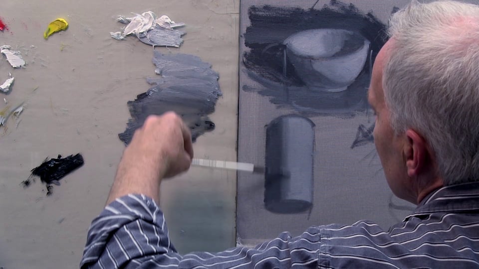

- Lesson Details

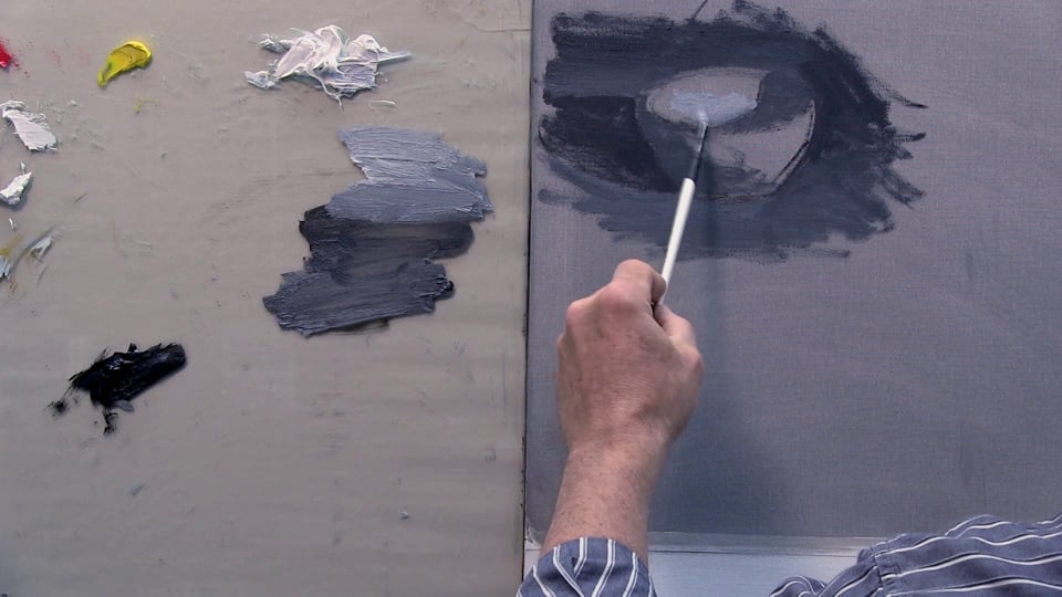
In this video lesson world-renowned painter Steve Huston will continue to demonstrate the laws of light by painting a simple bowl in oils. Steve will teach you how to break up your scenes into simple three-dimensional forms like the cylinder and how to analyze form as a series of planes, as well as how to work with value and half-tones.
Materials
- Gamblin Artist Grade Oil Colors
- Simply Simmons Paintbrush
- Canvas Panel
Beginner Friendly
14995 views
65 likes
This lesson has 3D Models reference. Subscribe now
Free to try
-
1. Introduction and lesson overview
47sNow playing... -
1. Starting your painting
16m 39sNow playing...
Watch the whole lesson with a subscription
-
2. Understanding forms and light
14m 31s -
3. Working with gradations
14m 23s -
4. Working with shadows
15m 22s -
5. Working with direct light & shadows
7m 50s -
6. Finalizing your painting
5m 10s


CONNECT
New Masters Academy
16182 Gothard St
Huntington Beach, CA 92647
Contact US