 UPDATE! October 1st, 2023: This version of the website will no longer receive updates. Please transition to the new website for the best experience.
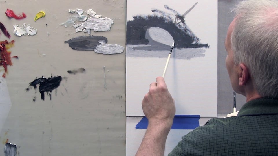

- Lesson Details

In this video lesson world-renowned painter Steve Huston will teach you the essentials of working with light and shadow using oil paint. You will be working on a single basic light source and learn techniques to mix your paints in order to get your “dirty” colors. You will learn how to paint a basic egg form and create the illusion of three-dimensional depth.
Materials
- Gamblin Artist Grade Oil Colors
- Simply Simmons Paintbrush
- Canvas Panel
Beginner Friendly
14292 views
76 likes
This lesson has 3D Models reference. Subscribe now
Free to try
-
1. Introduction and lesson overview
47sNow playing...
Watch the whole lesson with a subscription
-
2. Getting started
14m 26s -
3. Finding your light source
14m 37s -
4. Using light with your painting
15m 15s -
5. Finalizing your painting
11m 1s


CONNECT
New Masters Academy
16182 Gothard St
Huntington Beach, CA 92647
Contact US