- Lesson Details
- Transcript
- References
- Instructor
- Chris Legaspi
- Subjects
- Digital Art
- Topics
- Composition, Drawing Exercises, Sketching, Tools and Materials
- Mediums
- Adobe Photoshop
- Duration
- 2h 4m 53s
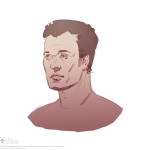
In week seven, you will start creating original artwork and compositions in Photoshop. Instructor Chris Legaspi will go over ways to set up thumbnail frames, make custom brushes, adjust values, and add tone.
Throughout this course, you’ll have access to the NMA community for feedback and critiques to improve your work as you progress.
Beginner Friendly
271 views
0 like
Discuss this video in the forums!
DiscussChoose one video.
AUTO SCROLL
Hello, I'm Chris Legaspi and I'm going to be the instructor for
this Photoshop lesson. In this lesson we're finally going to
get into the meat of Photoshop, the fun stuff, the drawing and
the shading. We're going to learn how to make our own comps
from scratch. Yes. I know finally, right? I'm going to
show you guys how to set up your brushes so you can draw, how to
set up your layers so you can add tones. And once we cover all
the various tools and techniques and tips I'm going
to give you guys an assignment so that you can try and use all
the tools you learn to make your own comps. So if you're
ready to get started, let's begin.
AUTO SCROLL
Transcription not available.
AUTO SCROLL
Transcription not available.
AUTO SCROLL
We're going to begin this lesson with a review. A lot of
the stuff we talked about can be a little complex, can be a
little intimidating. So I want to review as much as possible.
So we're going to briefly go over the major tools that we've
covered and that these tools we're going to expand on in this
lesson and then we're going to get into drawing. So we're actually
going to finally start drawing and then
add our own tones, values, and shading. And for for this
lesson, I'm going to go a little bit quickly. I expect
you guys to have kept up. If you haven't, please please
please review the previous lessons at any time and I'll
try to do my best as well to go slow, talk you through the
process, but a lot of the stuff here we've already covered.
Again just more review, more refinement, and just you know,
more expansion of your tool set. So let's get started.
All right, so let's do a quick review.
The first thing
we need to know of course is to
set up our canvas and we do that by
having a canvas, opening a file or making a new file. So this
example I'm making a new file and remember the file size
is really up to you. But I recommend 8 by 10 inches just
it's basically the size that you can print out on your
printer, eight-by-ten. Your printer will print it out. It's
just something that I like to do and 200 DPI. So this is a
new, file new. And remember you can also open. Command key for
opening, hot key is command O, command new. And you can also
open
an existing file. We have
a drawing or picture or even a blank canvas that you might
have already set up.
So here's just opening a previous drawing. So remember
you can open a file, create a new one.
The next major tool we're going to use in this lesson are the
selection tools. So remember we have marquees and they come in
very different shapes, squares, and circles. And we also have
lasso. Lasso has two different options or two main options that can
be used. Freeform lasso. You can draw random
shapes organic shapes and the polygon lasso we can draw more
precise geometric shapes.
So lasso going to be used quite a bit. Remember the short
key is L.
And of course since I'm going to be doing our drawing we're
going to be using our brush menu quite a bit. So let's take
a look at the brush menu now.
Now remember there's the two brush menus that I like to to brush menus that I like to
use or I like to keep open are brush, this all your brush
controls,
and brush presets. These are the
custom brushes that you make and you save and you can
organize them in various presets. It's kind of like
having your own can of brushes or your own container of
drawing pencils and tools.
And remember in the brush menu, we can change the shape of the
brush, adjust the spacing, and we have all these different
controls also on the left that we can fine-tune a brush and
we'll cover more of that but just keep in mind that these
two we'll be reviewing and using quite a bit in this lesson.
And also as for the windows, I like to group them together
along with color. So I like to put brush presets, brush ,and
color menu all in the same kind of menu group. Remember you can
group and tab as many as you want, but this is sort of the
layout that I like and the reason why
I like colors because I want to have this slider available, the
brightness. This will control how light or how dark my
my drawing lines are my ink lines will be and I could also
click on the little box to bring up a larger color picker
and for this lesson we'll be using mostly black and white.
So if you're using the color, the hue box here this color
picker box you can just slide the cursor up and down, the
far left side. So this is pure black and white.
So that's the
recommended menu setup.
And we also have the layers. Remember layers we can make
new layers by clicking this button. The shortcut is shift
command new.
Shift command new
create a new layer and we can change through order, you know,
we can put layer two at the bottom, layer one at the top, and
so on. We can totally change the order. We can
delete layers just by clicking the -
highlighting a layer and clicking the garbage can or we
can also click, hold, and drag.
And
we can also change the opacity of each layer. So for example,
I can -
I'm going to write using my brush here and write the word
100%.
And then you can change the opacity of
the layer. We'll use that quite a bit. And also you can duplicate
your layer
by dragging it to the new layer
button or
by the shortcut is command J. So now we have three different
copies of our layer.
So that's a quick overview of layers. The last thing that's
very important to keep your eye on is the options menu.
Remember options
is a bar, if you're using
one of the newer versions of Photoshop it's actually a bar,
little options bar at the top of your window there and you
could drag it off if you want. I like to keep it just tabbed
up there and the options that we're going to be looking for
up here to keep our eye on are opacity -
and remember opacity has a hotkey. So let's say this is
100%, we can do opacity. If we click five it'll change it to
50%. If we click one, the hotkey, go to 10% right? Barely visible.
And you can also change the
the opacity of your brush using the
slider there and also
one of the tools going to be using quite a bit is transfer
and transfer is
this button next to opacity there and transfer gives you
the option to
affect the opacity jitter.
Transfer gives you the option
to affect the opacity using your pen pressure.
Okay. The last thing we're going to review is zoom, pan, and
view mode. So zoom is a very important tool, especially when
we're doing thumbnails. So remember the shortcut for zoom
is
the letter Z or it's also the magnifying glass here on your
toolbar. And you click to zoom in
and you can hold alt to zoom out. Remember, you got to keep
holding alt to change the view mode. Now this may also be
reversed.
If you notice on your options bar, you notice that plus is
highlighted or zoom in. If I highlight minus or zoom out it'll
default to zoom out. So my picture will get smaller.
And then I hold alt to reverse. So it's up to you what you're so it's up to you what you're
more comfortable with. I like to have a default to zoom.
And what's cool about this and also pan
is that we can zoom in and we can pan.
And remember Z to zoom in and to pan is spacebar. And this is
useful because now if you want to get detailed - let's say
I want to work on this corner of the D. So I just pan it
and move it over to it's more comfortable space for me and
the shortcut is spacebar. Just press and hold space bar
and you'll be able to pan and now that I'm zoomed in, I can
add some detail here. You know, if I wanted to add a little
curly Q or something like that, little filigree. I don't know.
Right,
but all of this is much much more helpful when you can zoom
in.
That's pretty cool. And the final thing is the view mode.
Remember, there's three different view modes. We can
access them with the shortcut F. So this is windows view mode.
This is pretty nice because it has
window and we can have multiple windows open.
You can also have a full screen window mode. This is full
screen, but you still has Photoshop available.
And you also have your file menu here available. And hit F
one more time you get full full screen and this is
with no -
with no menu options at all. So it's all hidden.
And remember too we can also unhide our tools, hide and
unhide our tools with tab.
So that was a very very quick review. You can find all of the
more in-depth -
in-depth information on those tools in previous lessons. Okay,
so that was just a quick, very very quick review. I know I
went through it quickly. But again all of those tools we
covered in previous lessons. So please stop this video and
review at any time if you get lost or if I'm going a little
too fast. So now let's set up a canvas. So of course, we have
to set up a canvas. There's a couple of ways we can do that
and I'm going to show you ways that I set up a digital Photoshop
canvas for specifically for making comps and
thumbnails. Okay, so there's really two basic ways to make a
canvas.
You're either going to have a single image on one canvas, you know,
or you're going to have multiple. Sometimes it's called
a one sheet. You can have like, you know, for example you can
have -
you can have something like
this where you have,
you know, four different thumbnails on one sheet. That's
called the one sheet and we'll talk about that now but let's
say you just want - let's just say you just jump on your you just jump on your
Photoshop. You just want to do a quick black-and-white comp.
You want to start drawing, you're very excited about this, you
know, you went through the lesson you're super excited,
you're ready to get started. So
obviously
we know how to make a new canvas. Now the size I recommend,
I recommend keeping it - I like to do - what I like to do is keep
the DPI high, so 300 DPI and I'll talk about why that's
important in a minute. But I like to set the canvas size
pretty small. It's actually like almost like a sketchbook.
So for me, I'm going to treat drawing comps in Photoshop
exactly like I would draw it in my sketchbook, exactly the
same. I'm going to basically make a digital sketchbook
canvas. So that's what I wanted to show you here and you
know
to make a digital canvas just make it pretty much the same
size as a piece of paper. So what's a good thumbnail size?
Five by seven for large paintings. If you do it, maybe
you want to do just like a smaller painting but you want
to do a small thumbnail of course or a small illustration
I would say, you know, two to three inches. Let's just do -
let's just do two by four inches.
And
this is horizontal. Remember you can rotate your
canvas. Make sure you have a hotkey set up for that. We
covered that in previous lessons.
So this is a 2 inch by 4 inch. Obviously, it's way too
vertical.
Remember you can change your canvas at any time by going to
image, canvas size. And now we can make it 3 by 4.
And the background color was a little - was black because the
setting -
let's try that again. Because the setting under here,
canvas extension color was black. So I can set it to
foreground, background, whatever I have. In this case I'll just
set it to white.
And we'll make it three by four. Make sure you keep your anchor in
the middle and now it's nice and expanded. So this is a this
is a three inch by four inch 300 DPI digital canvas. And the reason
why the DPI is important
is because of resolution.
I'll show you two examples. So this one is
300
DPI
Like my bubble letters?
Like my old school bubble letters?
Let me fill it in for you real quick so you can see
why
DPI is important.
I know it's pretty exciting, huh?
This is 300 DPI. Now, let me make the same one but let's say
let's make it at 72 DPI, which is
the resolution of computer screens. So this is 72 DPI and
notice this one have much more to work with. Now watch what
happens when I try to draw on a three - even though this is three
inch by four inch, when I try to draw it will look a little
strange. Watch.
See that? I don't know if you can see it, but let me fill it
in so you could be a little bit more clear.
Blow it up some more. Now when I blow it up you can see the
difference, right? You see pixelation. Now, that's really
not that big a deal. Of course we're making - we're just making a
comp, a thumbnail, a sketch basically, it's not that big of
a deal but I say might as well
get some more pixels, get some more pixel resolution, some more
depth. You have much more pixels to work with. Sort of like
photography, you know, this is like shooting - or let's say
you're shooting a piece of artwork or you're shooting a
portrait you know, why go low res when you have the
capability - digital capability? Might as well give
yourself some pixels. So actually I'm going to - this is
72 DPI. That's incorrect.
Right, so you see the pixelation and you don't
want that in my opinion.
So that's why if you're working on a small canvas, something
like six inches, I would set the DPI pretty high to around 300.
So that's using a single canvas to make a thumbnail.
The next thing we can do is we can create a one sheet or put
multiple thumbnails on a canvas. So this one should work
perfectly because this is -
this is eight by ten. And what I'm going to do is I'm going to
bump the resolution up from this one.
So this is eight by ten inch at 300 DPI. So it's pretty high. And
the reason why I want high DPI is for print.
So this won't be for web. This will be something that - well
of course I can export it to website but something I can
print out and, you know, set alongside my canvas.
AUTO SCROLL
Now one of the more simplest ways to
make your thumbnails is set up a little frame. So
there's a bunch of ways to do that. A bunch of ways.
One way is
it's to just draw them and we'll talk about brushes. So
you could take like this is the default brushes in Photoshop.
Let me just take one of the plain old ones, the hard edge
ones that are defaulted.
Make sure it has a transfer turned off.
So nice hard edge
brush, hundred percent opacity.
And then, you know, just take this color, this pure black.
So I can just draw a frame and one tip is that if you hold
shift, right now I'm holding shift, and then if I lay my pen
down I could draw a perfectly vertical or horizontal line
just by holding shift.
And I'll talk about what just happened there in a minute. So you see I'm
holding shift, and I just I basically create a hand-drawn
looking frame. And you can - remember you can also call up
eraser.
You know clean up your edge. That's one way to do it.
That's drawing your frame by hand.
Another way is to use the line tool. The line tool is under
your
shape tool and the shortcut is U and it's these series of
shapes right above your pan, right above your zoom near the
bottom of your toolbar and remember if you click and hold
you'll see all the various options. You can do rectangles,
rounded rectangles, ellipses, and other things. Well, let's go to
line tool. And line tool is pretty cool because it makes a
Now the line tool is a very powerful tool.
It's very powerful, but it's a little bit complicated to use.
So I'm just going to show you just a few things.
It has various options that you can play with it.
I'm just going to show you a few things to make a nice straight black line
or to make any line in the future.
And line tool has changed recently in the last few years.
So I'm just going to show you the basics of the line tool enough
that you'll need to make a nice clean box or clean straight lines.
Okay.
First thing you wanna do is to activate line tool.
So you can do that here at the toolbar, it's near the bottom.
And if you shift and hold at the tool, it's where the rectangle is.
It's default to rectangle, but if you shift and hole, you can scroll
through the various tools you have.
I'm going to go with line tool.
These are all called objects.
These are like vector shapes that are generally used for
graphic design purposes.
They're really powerful, but a little bit tricky to use.
So I'll go ahead and select line tool.
And the hot key is U.
You can see that here, the shortcut there.
Okay.
So I have my line tool active.
Now, before we begin to make lines let's first, take a
look at the options bar here.
This is really important to know.
The first thing you want to do is make sure that this first box it says shape.
Make sure that it's set to shape.
It may be set to path by default
Make sure it's set to shape that way you have the options that we need available.
Next you'll see fill and stroke.
And this number here, which is the thickness.
So fill is obviously the color of the line.
A stroke is - it's going to show what the shape of the line is, it draws a stroke
around the line that we're about to make.
And then this is the size of the line.
And then this is the style.
So let's go ahead and make a line I'll demonstrate quickly.
So what you want to do is once you have your line tool active, make sure you
click and then you can hold and drag.
You can drag in almost any direction now, but if you want a perfectly
straight, you hold shift and now to lock it into a straight line.
Okay.
So this is my first line tool.
And then this properties window may pop up.
If you see that, don't worry about it too much.
It's basically the same options that we need are also going to be in the
tool bar, in the options bar here.
So let's go to the options bar.
First, let's take a look at stroke.
So right now the line is basically just a - it's like a little
thin blue mechanical line.
So we need to draw a stroke around it.
Right now this white check - this white box with a red slash
through it means no stroke.
So we'll click on that and then we'll go to the right of it.
And you'll see a few different options here.
Just click the first one to the right, which just means normal stroke.
And then boom, it made a line for us and it made it black.
So I'll show you the thickness so you can actually change the
thickness on the fly with a slider.
You can change the thickness on the fly with a slider,
or you can input the number.
So I'm going to leave mine at 10 pixels, and then obviously you
can change the color by clicking fields so you can make it white.
You can make it red.
Oh, it affects the next one.
But let's keep it black.
So apparently that only affects this one.
See the tool has changed quite a bit.
Okay.
So those are the main options that we need.
And you may also want to pay attention to this middle box, which is the stroke, how
it looks right now, it's a straight line.
You can make it a dash line.
You can make it a little polka dot line, but for now let's keep it straight.
So those are the main options you're going to need.
I know it's a little bit tricky.
Don't worry about it.
Just make sure to review this video.
So now we have our first line.
Now I want to make sure make the rest of the box.
So for this, you want to make sure you hold shift before you touch down.
Otherwise you'll make a new layer.
So watch what happens.
If I just touch my thing without holding shift, see, you'll get a new
layer, new layer, in that case I used shift, but see if you don't hold shift.
So hold - make sure you have shift held down and don't put
your cursor directly on the line.
Give it a little bit of space.
There you go.
Now what will happen is you'll make a stroke and it will be on
the same line and it'll be effected by the same option controls.
So that's our first horizontal.
Let's make a second vertical.
So the same thing, hold shift first, then click and then drag shift will
help you to make a straight line.
And again, our second horizontal, hold shift, then click then drag.
Okay.
So now we've got to hold a nice box around us and we have - they're all in the same
line and they're all - because they're connected because we held shift they're
all in the same - controlled by the same option so we can change the size, change
the thickness, can do all sorts of things.
That's the advantage of the stroke tool is just has a lot of power when
controlling its various options.
But again, you have to be mindful of the various options.
So now if you want it to clean up your line,
if you want to clean up the line, you can go back to your line tool.
If, say you want to clean up the edges, you know, you don't want it
to extend too far so you can use the selection tool, the shortcut is A.
Make sure it's the black one.
And then if you shift and hold, you'll be able to pull the points,
see that I'm pulling the points.
You touch, click the point, the handle, and then you pull it in and tighten it up.
Same thing here.
I'm going to click this vertical one, same thing and just click the vertical one.
Horizontal one.
Got to be very gentle when you click.
Otherwise you might move the line.
You don't want to do that.
And there you go.
Okay.
So cleaned up my box a little bit.
And line tool is great because you know, it stays nice and sharp.
You can scale it, you can change the size, you can change the style on the fly.
So this is the advantage of it.
So you may want to keep it - right now it's called an object layer.
You may want to keep it as an object layer.
See that little icon.
But if you don't want to keep it as an object layer, what you can do is
what you called rest rise.Basically turning it into pixels, sort of like
that first line we made, the first box he made with just our brush tool.
So you can take the object layer and typically what I do is I make a
new layer, just a clean blank layer.
And then I select the - I select together.
I do a group select of the blank layer, the one I just made, and
the object layer that has my box.
So now they're both selected.
See that they're both highlighted here.
And then you can merge them down.
The hot key is command E.
Command E merge layers, merged the selected layers and boom.
So now I have it on its own layer and now it's a normal, it's normal pixels now,
so I can erase it and things like that.
I can scale it as well and move it, but now if I scale it up, it'll lose
some of the density and the resolution.
So that's the disadvantage of rest rising, but it just makes
life a little bit simpler.
Okay.
So that's quickly a brief little example of how to use the line tool to make a box.
And the last way that I like to make frames.
And this is the one I use most often is I make a shape, a rectangular
shape, and then use the stroke feature in the layers menu.
Now there's a bunch of ways to make a rectangle.
You can take a marquee and draw, a rectangle, or you can use a
shape, remember just like line tool remember this creates a vector.
This is really nice because it allows you to manipulate it very quickly.
So that's a real great way to do that, but just for the sake of this
demonstration, probably the simplest way would be to use the rectangular marquee.
Just kind of draw a rectangle to the size you want, and then he could
fill it with, any color really.
It really doesn't matter because we're going to make it transparent
and I'll show you that in a second.
So that's really nice.
Now you can also
- if you're more - if you want to be more precise, you can also
make a box with a fixed size.
So if you have marquee selected under style, you go to fixed size.
This defaults to normal, which I just did.
So go to fixed size.
And now you can actually input the height and width.
So let's say I want to make a box that
oh, I don't know, a rectangle that's, 250 pixels wide by 500 pixels high.
And then if you do that, now you have a nice precise size rectangle.
There are just a couple of ways to do it.
And again, any thing you make, you can transform it.
Command T you can transform it, scale it, and things like that.
But just want to show you that you can do a precise size using the marquee tool
and the option of style under fixed size.
So going back to the original rectangle that I made, what I'm going
to do is make a stroke around it.
And to do that you can simply go to select the layer that has the object you want
and one you want to make a frame for.
So have my black rectangular box here.
Now I'm going to go to effects and go to stroke.
And this will show you the stroke.
I'm going to just make one there and then we'll play with the feature.
So now you might be thinking okay, well, I don't see a stroke still black box,
but what we're going to do is go to fill.
If you look at the top of your layers menu, there's opacity and fill, so
take fill, and turn that down to zero.
So now what it does is it makes what's in the layer, what filled the layer, in this
case was a black box, and made it fully transparent and it leaves the stroke.
Now you can just see the stroke that I've made.
So let's play with the stroke feature.
I really liked this part of the layers feature of the stroke.
So double click on stroke and remember it's under layer effects.
So this little effects dropdown stroke.
Double click on stroke here to bring up layer styling and with stroke active
now you can adjust the size on the fly.
That's really neat.
Right now it's at six, you can make it 60, 120, whatever size you like.
Let's just keep it a 10, like we had before.
And another thing you can play with is position.
So right now it's at inside.
You can make it go center or outside.
Notice, the curve that happens when you have it set to outside.
What it does is interpolates the coroner, it turns it into a curve.
So you may want that.
You may want to have a nice quick curve so you can put position outside or center.
But I like inside.
I want that razor sharp corner.
So keep it inside a blend.
Well, don't worry about that too much.
It's just like the layer blend mode.
You can play with that, make sure it passes all the way up
and you can change the color.
You cab have a grey border, a white border, which you can't
see on this paper changed the color, whatever color you want.
It's really fun, real powerful, easy to use, but just for
this sake, nice and black.
And there you go, click.
Okay.
Now I have a nice frame that I could use for my thumbnailing.
And what's cool about this
if I transform it,
I can adjust the size, but the shape or the stroke stays really, really sharp.
So that's really nice to use the layer styling here for that's why this is
my preferred way of making frames.
Now the last thing we want to do is actually set up our
nice little one sheet. Let's say I'm going to make four
thumbnails on one sheet. So - oops, still have fixed size.
Going to bring it back to normal. I'm just going to make
Going to bring it back to normal. I'm just going to make a box, just to make it quick, just draw a rectangle with my
a box, just to make it quick, just draw a rectangle with my
marquee.
I'm going to fill it with black,
drop my fill, then add a stroke. I'm going to make my stroke
inside 24 pixels.
And then
make sure it's nice and black. It looks pretty good.
I know this is a little too tall for this sheet. Of course
I can change the canvas size at any time. Okay now that I have
my box
and I have it at a pretty good size. You know, I scaled it.
What I can do now is I want multiple boxes and there's a
couple ways to do that. One is we can duplicate the layer,
which we already know how to do. The shortcut is command J.
Duplicate the layer now. We have two, one, two, but they're
stacked on each other so we can just move it to the side, whoop.
And remember the move key is V.
And if you hold shift you can move it perfectly vertical left,
up or down or horizontal.
And the newer versions of Photoshop had these guides,
which is pretty cool. You might see it on your screen as little
pink guides to help me lock it in place.
And the last way - I'm going to name it. I'm gonna name it
frame one. Gonna name this frame two. The last thing we could do.
The second way we can duplicate is to literally drag it. So
what I do is I like to hold - activate the move tool which is
V, hold shift alt and what this will do is it will
duplicate and drag. So watch this. I'm holding shift and ALT
with the move key active. Right here. And then
boom, you see what happened? Made a copy and because I held shift
I was able to drag it perfectly straight down. So gonna call this
frame 3.
And then what I'm going to do now
is I'm going to take frame two and do the same thing. Hold shift
and ALT with the move tool active, okay just add a
little arrow, then whoop, drag it and then use the guides to lock
it into place. So these are four perfectly spaced squares.
And you can keep them separate but I'm just going to -
I name them just so that you can see it watching this video,
but pretty much I just make four and then merge the groups
and remember you can hold shift and click to merge or you can
hold shift at the top and then shift at the bottom. It's just like
working with the Windows folder or Mac folder when you're
selecting files, and then the command E is merge down or
merge selected. And then boom,
merge into one frame.
And then
you can move this layer around, fine-tune it. You can even crop
really tight if you want. Let's do that now, so I'm just going
to crop, just draw a marquee around my canvas then we do
control, command C. And boom, crops it to my marquee and you could
of course you can always add to your canvas at any time
and this is my frames and then what we could do is make a
new layer and then boom, start drawing right underneath the
frame. Make sure that our bottom layer is active.
Call it drawing one, just to name it, just so I know what I'm
doing.
I'm call it you know, I'll just draw
a little thumbnail of - that's me with my big old ears.
There you go.
That's his pointing finger. Number one,
right? And it's right underneath my frame. It's nice and it's nice
and
locked in a frame. And we'll talk next about how we can keep
the edge really tight. But this is
one way I like to draw eyes with just basically make
a series of frames that - you don't have to make four of
course. You can make a whole bunch,
as many as you need.
I'll call this one - let's draw a -
let's give him a friend here.
And she's holding up a peace sign, number two.
Just a nice little basic drawing.
You can name it.
Now you can change the order of course. That's one way
to make frames using just a nice hand drawn box, just like
you do on paper. I would do the same thing on paper. I would
take an ink pen and go whoop, with a rule and go
whooping, the t-square. Whoop, do the exact same thing. But in
Photoshop we can do it in five seconds, and we have layers and
other editing tools to help make us more efficient. Okay,
so that was just a quick way to make frames. The second one is
so that was just a quick way to make frames. The second one is a little bit cleaner. Is the one that I use more often,
a little bit cleaner. Is the one that I use more often,
we're going to use a combination of what we learned
here and we're also going to use the alpha mask.
So alpha mask is one of my favorite things in the world,
also known as the layer mask.
So let's say I want to make
six
frames, let's say I want to do -
let's say I want to draw a bunch of movie posters or
advertisements.
Or vertical paintings or drawings or designs. Let's
close this guy, we don't need that.
And I just turned my canvas horizontal and I did that with
the shortcut. And remember you want your flip canvas shortcuts
and the image rotations, they're all here under image,
image rotation and notice I have mine all set to shortcuts.
And if you haven't already make sure to do that, of course for
thumbnailing you need it and this can be found in the
previous lesson that you can review how to make your
shortcuts.
So I have a
horizontal. Let's say I want to make 6. I want to make them
perfectly evenly spaced. So what I'm going to do is I'm
going to use a vector because vector is really tight, really
tight, and I can scale and resize and I won't lose that
much.
So I'm going to take a - just a rectangle shape. What I'm gonna
do is I'm going to draw
a nice little box, nice little black box.
Then I'm going to duplicate this black box.
Oh and I use the same exact technique, shift and alt to drag,
activate move tool.
In this case you have to activate your selection tool.
This is a different way to select and this is selecting
objects. And the shortcut is A, it's called passe selection.
Notice it's right above your vector objects.
So if you have used A to select your vector object, in this
case my box, hold shift and alt and then boom.
And you can drag it vertically or horizontally.
And I'm just eyeballing the space you can make it more
precise, but for thumbnails, I really really don't see the
need.
Now what I'm going to do is I'm going to duplicate these three
other boxes.
And just drag them down.
Make sure there's a nice vertical space between them.
And here I'm using my arrow keys to fine-tune. Now I have a
problem.
My boxes are not the right size for this canvas so I can either
increase the canvas or I can just change the size of my box.
So I'm going to do that. So I get all my boxes on one layer.
So I'm just do a command T. Boom. And it selects all of
them and then I'm just going to slightly shrink it in and I
can even slightly expand it out so that it fills out
my eight by ten canvas a little better.
Okay, so now I have six different boxes
that I do and you don't have to use the objects, you can
definitely do this with the marquee box. So what I'm going
to do now is I'm going to make a mask and then I'm going to
use the mask as a literally a mask so that I can start
to draw underneath and have a nice clean and tight frame. So
to do that, once you have your boxes, basically I'm laying out
the boxes that I'm going to be drawing in, the little - my
little frames. Once I have the the layout I want I'm going to
go through the layer with my boxes, and I'm going to hold
command
and click and what that does is it'll draw a selection. Notice
now there's marching ants, an active selection around my box.
So what I'm going to do,
first I'm going to make a fresh layer and I'm going to fill it
with black. So fill it with black.
Okay. Now I'm going to make my rectangle visible just
to make it active. Then I'm going to hold command and click,
boom and draw these the selections, the marquees,
or actually draw the selection and make it active.
Then I'm going to go to my - the layer I just filled in and I'm Lair. I just filled in and I'm
going to call this
a mask or frames.
And then when the selection is active
going to click my alpha channel button, boom, and what that does
is it draws an alpha channel based on the selections that
are created. But of course this one's inverted, see if I make a
new layer underneath and I try to draw it only draw in the
gaps, which I don't want. So what I want to do is select the
mask and invert it and the shortcut is command I. Boom.
So now I have my mask, a
series of frames,
and then I can draw underneath just like we did before,
right?
But this time we have a tight
frame.
Remember before we could see the drawing, go outside of the
boundaries. Now, we have it inside the boundaries.
So we don't have to worry about this stuff. And we can even
expand.
Let's say you want more negative space. So we can either
shrink our frames or just expand the canvas. In this case
because I need some more space on this side it's a little crazy.
So I'm just going to bring up the crop tool. It's another
quick way to expand and what I'm gonna do is go to the corner would do is go to the corner
and hold shift and what that'll do is do a uniform scale
to a perfect ratio. Perfect aspect ratio.
And just expand my canvas.
Then what I'm going to do is
move - I want to keep my drawings where they were now just going
to -
what I have to do now is all I have to do is expand my
mask to go - fill this white space to cover the white space.
And to do that I can either
make a new layer, fill it and duplicate the mask, or I can
just take the one I have and one of these I'm going to
delete it. So going to select all, that layer. Delete it then
I'm going to fill it back again with black. This time it'll
fill the entire layer, entire canvas and there it is. Then
I'm going to make sure to link my mask. So now I have
nice, beautiful
mask to cover my thumbnail. So this is typically how I work if
I was doing thumbnails for professional illustration work.
And finally, don't forget if you want to check your
thumbnails you got to have flip canvas hotkey.
Mine is set to F2, you can change it to whatever you feel. Definitely
you need flip canvas hockey and it'll come into play
throughout your entire career, of course, but definitely when
you're working in digital, it's very very useful. Okay. Now we
have a canvas ready. I showed you a couple ways to set up a canvas
and to set up a one sheet or a page full of different - full of
frames that you can make quick little thumbnails that you can
use
to print, to display, or of course to blow them up and to
make them more refined artworks.
AUTO SCROLL
Okay.
Now let's explore making our own set of brushes or our own custom brushes.
So this is a lot of fun to do, and it's very, very powerful and very, very useful.
So from my experience, there's really only four types of brushes
that I use and that you will need for most of the tasks you do.
The first is a hard edge or a sharp edge type of brush.
The second is a sketching or pencil type of brush.
The third is a soft air brushy brush for blending and gradients and things.
And the fourth is texture.
So the first type of brush you'll need is some kind of hard-edged brush.
I like to think of it as like an ink pen, very hard edged kind of inky sharp edge.
The next is a sketching type of brush and this has a little bit of texture to it.
So it kind of simulates the pencil.
And for soft marks I like to have soft brushes, air
brushy type brushes like this.
These are great for gradients and blending, obviously.
And the last, just show you is texture.
This one's got like a little bit of a ink splattery kind of texture.
So these are the types of brushes that you will - can -you'll be using quite a bit.
So now we're gonna make our own set of custom brushes.
Okay so let's make our own hard edge type of brush, sharp edge
brush sorta for inking effects.
And also this brush is great for masking and making selections and things.
So I'm just going to - in my default menu here, I'm just
going to pick this one here.
Let's pick one.
This sort of like blobby hard round shape right there.
So I'm just going to pick that because it has a pretty hard
edge, has really hard edge.
So let's go back to brush settings and we will play with it and customize it.
So make sure we have a brush tip shape selected here.
And now we can see the all of the options we can have to manipulate a
brush and rotate hardness and spacing.
So for our first hard edge type brush, we want to make sure
hardness is all the way up to 100%.
For this first brush, I want to make sure my spacing's down at 1%.
That means there's no gaps, no spacing.
So it's really tight and crisp and sharp the line.
And I also for this type of brush, at least the one that I use for making
masks and things, I want to make sure my opacity is at a hundred percent.
So if you look up your brush, uh, at your options menu here, way at the
top, this little bar, you want to make sure that your oppacity's 100% for
this first type of brush you make.
It's be really sharp, really hard.
Generally when you're painting your passage will generally be at
a hundred percent but just to make sure for this type of brush, and
now what I want to do is make one that kind of has a thick or thin.
So it's really nice to draw with and kind of has a little bit of an ink line look.
So for that, I'm going to go to shape dynamics.
So I'm going to select shape dynamics, make sure it's a selected so it's
highlighted too, so it opens a sub menu.
Don't just click the box.
You want to make sure it's selected.
So under shape dynamics, the thing I want to look for is control at the very top.
Make sure your control is set to pen pressure.
And now that minimum diameter becomes open.
And for some reason you don't see control it, probably because it's a setting
with your tablet or it could be, you might see a little triangle here with
exclamation mark means something's wrong with the driver, so that's a
technical issue, but generally, if your tablet is set up correctly, you
will see this menu available here.
So now I have control pen pressure, minimum diameter.
And if play with the slider, look what happens to the thumbnail?
The tip gets smaller or larger or fatter.
Let's go all the way down to zero and it comes to a nice sharp point.
And let's see what that looks like.
So you see it has that thick or thin look, I really liked that.
Very much like an ink pen.
So this will be great.
I'm going to make it a little bit smaller.
Go to my tip shape, decrease the size a little bit.
So let's make it 20 pixels.
This would be a nice drawing, you know, for inking, get that comic
book ink look kind of, and it's great for making detailed mass and things.
So I like this brush, so I'm going to save it.
So I'm going to go back to my brushes menu.
And I'm going to make sure I don't have a folder selected.
Just for this example I want to make my own set of brushes and
group them in my own folder.
So I'm going to go,there's a couple of ways to can save a brush you.
Like one is to go to the dropdown and say new brush preset, and you can name it
what you want or call it hard edge detail.
We'll just call it that.
So there it is.
There's my first custom brush.
It's a hard edge brush that has shape dynamics.
So it does thick and thin, really nice for detail.
So I like that.
And now what I want to do is I want to make a couple variations of this brush.
I want to make a big one in case I have to feel large areas and I want
to make one that's not thick or thin.
I kind of want that just the plain old blobby round look.
So I'm going to take the brush that I have, go to pressure presets or brush
settings again, so I can manipulate it.
Or you could also come up here and select here.
I have recent brushes active.
So you can just select that as well.
Let's go back.
Let's say I'm at this brush and I want to make it bigger and have a thicker end.
So I'll go back to shape dynamics.
And instead of going all the way to zero, I don't want it to go to a hundred.
I want a little bit.
So I'll just, let's say 80%.
I could also turn it off.
So it's full 100%, but let's just give it a little bit of.
Little bit of thick or thin, so 80%.
So it's still nice and thick at the tips.
Go back to brushes.
Excuse me go back to brush tip shape.
And now I'm going to play with the size here and use this slider.
Or you can use the hot key, but just for the sake of the
play, you can use the slide.
Let's say I make this a hundred pixels.
First one was around 20.
So this is a big - that's a pretty big brush.
Let's see what that looks like on my canvas.
All right.
So let's see.
It's a much bigger mark.
So it just helps me if I have to cover large areas, I have that there.
And let me play with the diameter a little bit, keep it a little bit thick or thin.
So now it's sort of more like a big blobby ink pen, really.
So I like that.
So now.
I want to save it.
So remember the first time we used this menu, new brush preset, but
we can also in this brush's menu at the bottom here, there's a little
button that creates a new brush.
So you click that and there it is again, creates a new brush.
You just call it hard edge brush large.
And there it is.
That gives me my first hard-edged brush that I need
Right now I have my first hard-edged brush, sort of my ink pen brush.
Now I want to make a drawing sketching brush.
So this brush will simulate sketching with a pencil or any type of dry media.
So I'm just gonna start with this hard, this kind of hard inky brush
that I made earlier, and we're going to give it a little bit more texture.
So I'm going to go to brush settings.
Now there's a couple of ways to add texture to a brush or
to make a brush feel textural.
There's actually a bunch of ways.
I'll just show you a real quick and simple way.
First is we'll go to brush tip shape.
And for this brush, I'm going to start by playing with spacing.
And remember spacing creates little gaps between the pixels when you
make your stroke, make your mark, and look at this, look at the thumbnail
at the bottom here, you can see as I go up, it creates little gaps.
And what that does is it adds a little bit of sort of this - these
gaps create a little bit of texture.
So now.
It has - the shape is round.
So it looks like little polka dots.
But we can add more settings to increase the feeling of textures.
So I'm going to keep my spacing in this case around 180%.
Just give it a little bit of space.
Now I'm going to go with a second setting, which is scattering.
Let's go to scattering.
And what scattering does is allows me to scatter the pixels, the marks.
So we have a couple of controls here.
One is a scatter count and count jitter.
So let's play with count.
Count is how many - let's play with a scatter first.
Scatter shows you, if you look at the thumbnail, now the marks I
started to scatter or go far apart.
Let's do a play with the control, varies on the kind of pen that you use.
And if we do, if I click both axes, it kind of goes up
and down and left and right.
I saw X, Y axis, and that was kind of really scattery.
And if I play with the count, you see, you can get more or less.
So let's play somewhere in the middle and now we have a nice texture.
Let's see what that looks like, and I'm going to drop the size.
So it feels - so, yeah.
See how it's a little bit more texture.
It's different than this first one that I made.
It's a little bit texturey.
Now we can change the shape of the brush, so it feels more like a paper texture, but
I'm just for this example, I'm going to go back to tip shape, play with the spacing.
Now I have my first sort of texturey brushes is very like a really dark
colored pencil or conte like a waxy dark pencil, but has a little bit
more texture than this first one.
So I like this brush.
I'm going to go ahead and save it.
Go back to my brushes menu.
And I'm going to click this button here and I'm just going to call
it drawing one and now I have it.
So my first drawing brush.
Okay.
Now what I want to do is I want to take the - this brush and create
sort of like a thick or thin and also create a drawing effect, simulate the
drawing effect of the opacity or the amount of pixels or ink or material.
So to do that we're going to use that setting called transfer.
So you go back to your brush settings menu.
I have my - that first ink brush that I made now I'm
going to go to brush settings.
And under in the brush settings menu, there's an option called transfer.
So I'm going to select transfer.
Remember you want to select it to make it active.
It opens the menu, the sub menu in the sub menu, you have opacity jitter, flow.
But the one first thing to pay attention to is control.
Make sure it's set to pen pressure.
So that's related to your tablet and now you could play with minimum.
And opacity jitter.
So what does does it creates sort of - it simulates the amount of pixels
that go down when you make your mark.
So for example, if my - if I have my minimum set to zero,
let's see what that looks like.
You see when I, when I lift up my pen, the line is light, so
it's less - it's more opaque.
And as I add pressure, it gets darker and darker and lift up,
lift up and lighter, lighter.
So it's really, really cool to add that extra layer of ticker thin.
So this, you know, this kind of simulates like a colored pencil in
the way, get that thick or thin.
So I really liked that.
So I'm going to go ahead and save this brush as one of my drawing brushes.
Okay.
So go back to brushes and then I'm going to click this button
here and call it drawing two.
You could also rearrange them as you make them by dragging and such.
But now what I have is a nice - my first set of drawing brushes.
So I had this one here is thick or thin with some texture and have
this one here it has thick or thin with not texture, but it has that
opacity, that transfer control.
Okay.
Now I'm going to show you the third way to make a textural type brush.
A drawing brush that has some texture in it is just to
start with the textural brush.
So I'm just going to go into my brushes here and just the default
brushes that come with Photoshop.
I'm going to click this one here in my brushes folder here it has a nice texture.
If you zoom in, you could see that the shape right has some nice texture to it.
So this would be great.
And the simplest way to do this is to just make it smaller, decrease the size.
So here I'm going to drop the size to like just 10 pixels and see now it becomes
a line, basically a sharpened pencil.
Basically it has nice texture.
So I really liked that, real quick way to do it.
And what I also want to do is with this brush active, I want
to add that opacity control.
So go back to brush settings.
Let's take a look at the tip shape.
See it has some spacing.
Oh, it has a bunch of settings has like a dual brush.
I'm going to turn that off, turn this off.
I just like to keep things simple, has texture too, but really want
to - well all that other stuff.
I like to keep things as simple as possible.
So I'm just going to go straight up to and define my own.
So here, I'm going to take this texture brush that I started
with, it has some nice spacing.
I'm going to drop the spacing, give it a little bit of spacing so it
has some texture,, shape dynamics drop my minimum down pretty low.
So it has really nice sharp point.
Just like when I draw I want to have sharp pencils, play
with the spacing a little bit.
Excuse me, a little bit more texture.
There you go.
A bit more or paper feeling.
And then finally, I'm going to add the transfer control to add opacity.
Remember that opacity looks nice.
I'll go to transfer make sure it's active.
And then under control, pen pressure play with the minimum.
Also played with the opacity of it.
I'll just play with that a little bit.
See what that looks like.
Oh, that looks nice.
That's a nice, kind of almost transparent sketchy brushes, that'd be great.
Flow was turned down here.
So now when I press down, it gets pretty opaque.
When I lift up, I can get these light pencil marks.
So this is great.
It's a great start.
I like this brush has to be really nice.
Brush for drawing and sketching and Photoshops.
I'm going to go ahead and save it.
So go back to my brushes.
I've got to get out of this folder cause I wanted to make my own folder eventually.
And then go to this - click, this little button here, or number in the
dropdown to find new brush preset.
So I'm going to click the little button here.
Boom.
I'll call it sketching three, drawing three and there it is.
Now I have my three basic types of kind of sketchy brush had the kind of like,
not textural one with opacity, textural one it doesn't have opacity, but lots of
texture and one that has texture and has that opacity control of the transfer.
So this one, it looks really nice.
Okay.
Now let's create some airbrushing brushes, some soft brushes.
I'm going to go ahead and open the default Photoshop brush deed.
The default airbrush is actually really, really useful.
I just clicked one here in my brushes menu.
This one comes with Photoshop.
It's just a big round fuzzy brush.
That was really useful.
I can just play with the size.
We'll go to settings to see what the tip shape is.
So this one has some spacing.
I don't really want that.
I'm going to drop my spacing down and right it's at 200 pixel.
It's a big old brush and this one luckily has transfer already set, well, let's
take a look at it without transfer.
So without transfer, it's a little bit - it's soft on the edge, but
it doesn't have that opacity.
So we're going to bring transfer back.
So I like this brush.
I'm going to go ahead and save it as my first airbrush, I just basically
took the Photoshop brush and played with the settings a little bit.
Go back to brushes and make sure outside the folder.
Now I'm in my own stack here.
I'll call it new brush preset.
I'll just call it airbrush large, can name it whatever you want.
And I have my first large airbrush.
And if you - for some whatever reason, you don't have access to
a, uh, a generic airbrush, you can make your own very quickly.
I'm just going to click this generic hard round, show you what that looks like.
It's also in the default brushes that come with Photoshop, it's just basically the
default Photoshop brush, hard and round.
See that?
So I'll go to brush settings, go to tip shape.
And now here this hardness all the way up and now I'm just going to crank it all the
way down and to see what that looks like.
See what that does?
Nice and soft.
Really cool.
Now I have airbrush made my own airbrush just by turning down the hardness, but
what I also want to do in this example is I want to make it even more subtle.
So I'm going to go back to transfer and play with the two controls, the
minimum control and opacity jitter.
So turn my minimum all the way down and now let's see what that looks like.
So I have a pretty nice, basic airbrush I can use for blending.
And I made that from - remember we started here and now we have this
just by using the two controls here and specifically transfer at the end.
And now what I want to do is play with the shape.
So let's say you want to simulate more of a flat brush look, this would be
great for like, this would be great for simulating airbrush effects.
Obviously just the plain round airbrushing look or it's great for
simulating like a finger smudge.
If you want to blend some tones or maybe a paper stump.
I like to use stumps when I do my drawings and things on dry media for blending.
But what if you want a soft sort of blending a flat brush look.
Well, we can go back to tip shape and we could play with the cross hairs.
Remember the cross hairs.
So you go to the cross hairs and I'm going to make mine.
I changed the angle a little bit to 90 degrees, and then take these
handles, these two handles on either side and just pinch them together.
See what that looks like.
You can see there's the shape of the brush changed too.
So now it's a little bit more flat, so it's kind of a flat airbrush.
And of course you can do this with any brush with the
ink brush, the pencil brush.
But for airbrush it looks really nice.
And what I want to do for this is let's play with the make it really
flat now one thing you could do to make it follow your stroke is to apply
the shape dynamic stroke control.
So we go to shape dynamic and under - close to the bottom here, you
have this thing called angle jitter.
So you want to turn that control onto direction.
Angle jitter and then control direction.
So what that does is now whenever you stroke, whatever direction you stroke,
the brush will follow your stroke.
You see that?
If I go left to right up and down here it's following the curve.
That's really useful for just making a flat shape brush for blending or
making airbrush marks, soft marks.
So I like that.
I'm going to go ahead and save it and make sure I'm out of my menu
here, back to my own set and go to new brush preset or click the button.
I'll just call it soft and flat.
And there it is.
Got my first soft - got my first set of soft brushes for blending and airbrushing,
but this one is nice and flat.
Okay.
And the last type of brush that we're going to need is a textural brush.
So this is obvious.
Texture is really nice to add to your work, and it's very, very simple
and fun and easy to do in Photoshop.
So there's a couple of ways to make it probably the two most useful
ways that you will need is to just start with a textural brush.
Photoshop comes with some pretty nice textual brushes already.
So I'm just going to grab one under, under the dry media stack
or dry media folder, but let's see.
Let's see what media looks like.
Interesting ones.
Okay.
Has its own effects.
Let's see what this one looks like.
Oh, that's a nice one.
If you look at the shape, this one has some interesting - okay.
Here's a nice one.
Sort of has this leafy texture as this is great for this example.
So you just grabbed one.
This one came with Photoshop.
That's pretty nice, but let's say you want to, you want to play with it.
You want to refine it to make it your own.
So first of all, I don't really like - it goes to a fine point in shape dynamics.
I went back to brush settings here too.
I can play with the brush.
Let's go to tip shape.
Okay.
It has some spacing.
That's fine.
Just keep that there let's go to shape dynamics.
I don't like the minimum diameter here.
So I'm actually just going to raise it up a little bit.
Let's say go to 75%.
So now doesn't go to quite sharp point like that.
Let's play with scattering.
The amount of scatter.
Oh, it's more texturey.
Let's do both axes.
See what that does.
Okay.
And count.
Oh, you have a lot or a little, let's try this.
Let's see what this looks like.
Oh so I like that.
It feels a little bit more organic.
I like that.
I'm going to go back to tip shape and play with the spacing a little bit.
See what that does.
Oh, I like that.
See, this kind of feels organic, you know, it's a quick way in
this case, they look like leaves.
So this would be great for adding foliage, but obviously you can use
it for any type of texture, material fabric or mountains or things.
So I kinda like this.
Now, what I want to do is going to add a touch of opacity control
and remember that's in transfer.
There's a whole bunch of controls here actually.
But you know, like I mentioned them earlier in the brush menu is
incredibly - has incredible depth, but let's just play with transfer because
transfer is quite useful and we'll go to remember control pen pressure.
And this time I'm going to turn my minimum, not all the way to zero, but
sort of halfway and see what that does.
Oh, that's nice.
I like that.
See how by lighten it, I guess a little bit more transparent if
I press hard, it's more opaque.
So it feels a little bit more natural.
I like that.
And let's say, I want to save this brush.
Obviously you could play with the settings until you're happy and
just have a lot of fun with it.
So go back to brushes added to my collection.
Make sure I get out of this main - this folder here, go to my
own folder outside of the folder.
And then I'm going to click new brush preset or click the button.
And here we go.
Call the texture number one.
And I have my first texture bush.
Now the second way to make your own texture brushes is to use your own
- create your own brush preset from scratch.
I'm going to show you how to do that.
This is a lot of fun.
It's a little bit complex.
So follow along with me.
But it gives you a lot of control.
Obviously you don't want to rely on.
Photoshops default brushes or other brushes that you may download or use if
you want to make your own from scratch.
This is how you do it.
So what I like to do is I like to start with a new document so I can actually
make what the brush shape looks like.
Remember up here, you could see the brush shape, the brush has it shaped
that we can later play with and adjust and fine tune in the settings.
So let's make a brush shape our own shape.
So I like to start with a new document and this one will be a square document.
So go to file new.
And I'm just going to create - I'm going to use pixels in this case.
Excuse me.
I'm just going to go with 500 by 500 pixels.
A perfectly square canvas has 500 pixels.
That's what it looks like there.
So this'll be my little brush maker, little canvas here.
And so I'm just going to make a set of markers.
Again, there's so many ways to do this.
I'm going to make just a fun brush with organic squares, how about that?
Or organic shapes?
Just really graphic looking shapes.
And I'm just going to use the marquee to draw - to draw a rectangle and I'm
just going to make randomy rectangles random squares, just for fun.
And I can even just make sort of off center square.
You could use whatever shapes you want.
I'm just making really interesting random shapes.
So these are just some nice random shapes.
Add one more in the middle, just for fun.
And
I honestly have no idea what this is going to turn out, but when you add different
settings, it'll look really, really cool.
Let's make a little tiny dot here.
See what that does.
All right.
There we go.
So nice - so it's the shape.
This will turn into a shape.
So we go to edit and then define brush preset.
And gonna ask to name it.
So I'm just going to call it custom one.
And then boom, it pops up into my brushes menu here, brushes menu window.
Let's see what that looks like.
Oh, see it created the brush for us?
Really nice.
You can see the tip shape and then the stroke.
Okay.
That's interesting stroke, but I want it to be textual, so let's play with that.
So let's go to brush settings and we'll go to start with tip shape.
Obviously you need to play with the spacing, so that's nice.
I could rotate it.
I could pinch it, but what I want to do is give it a little bit of
spacing so I can add scattering.
I'm going to go to shape dynamics.
I'm going to put the control on.
I want it to go to a little bit to a point, not zero, but a little
bit of a point, that's nice.
And this case, I'm going to change the angle jitter to a pen pressure.
That way it rotates the brush as I go through this, there'll
be a little bit more random.
I want it to feel random.
You can play with the - let's go back to pen pressure.
You can play with these settings forever, but this just, this angle just
basically changes the angle of the shape as I make a stroke so way to do that.
And next I want to go to scattering here.
You could, you know, play with how far apart they go.
I like in this case I'm going to leave both axes off.
So I'm just going to scatter one way.
Okay.
That's interesting.
And let's play with the count.
Okay.
Okay.
That looks pretty good.
I like that actually.
See it's like texturey but it has this crazy geometric feel to it.
All right.
Go back to tip shape.
And I just want to play with the spacing and see what
happens if I have less spacing.
Oh, that's nice.
A bit more intense, more spacing.
So it has creates lots of spaces and gaps.
I like it less spacing, so it's a little bit more.
Okay.
So that feels pretty good.
It feels pretty good.
I could also add the transfer.
Remember that thick or the opacity control with transfer.
But kind of like this brush, it's nice and random.
It's interesting, chaotic.
So I really like this brush.
I'm not going to worry about, I'm not going to transfer this one.
So I'm just going to go ahead and save it.
And this time we'll just click the button.
Boom.
I'll call it custom one texture because it's for texture.
And, remember this guy, this guy popped up in our menu when
we created a new brush preset.
So I'm just going to go ahead and delete that.
So now I have my nice stack or my nice first set of brushes and my
really interesting custom brush here.
But obviously you don't have to use squares.
You can use - you can make circles, diamonds, a whole
bunch of ways to make the shape.
You could even take a photograph.
But I find this to be really, really useful because then you can have
more control with the shape and starting with geometric shapes it's
just really simple way to do it.
So one of many, many ways to do it.
Okay.
Now what I want to do is I want to clean up my brush settings or
excuse me, my brushes menu here and just clean up and organize it.
And you know, there's a couple of ways we can do that.
You can organize it any way you like, but for me, I like to keep things simple,
simple, simple, just like in drawing.
I like to keep my Photoshop simple.
So what I can do is first I can group them.
So if I do shift click and then shift on one and then shift as I click, I can
add all of the brushes that I want to group, because now they're all selected.
I can group them and name the group my first brushes or put
whatever you want to name them.
So now they're in their own folder.
Really, really nice.
And to be honest, I don't like I never, well, not never, but for this
case, I only need one set of brushes for starting out in Photoshop.
So I probably don't need these other ones.
So I'm just going to go ahead and delete those.
So here I'm going to drag them.
So now I have really nice and clean my first folder ready to go.
And what's also interesting if you - if you say you like a brush but you want to
change the order they appear, you know, you can move them, you can take your
inking brush and move it up and down.
You can take this brush, move it up and down.
So that's another way you can organize your brushes, whatever
way you feel works for you.
I typically, I organize my brushes the way that I draw.
So I put my drawing brushes at the very top, you know, and then I put
the brushes I would use for the next step of typically my works at home.
And so softer brushes beneath that.
And then the last thing I do is texture.
So this order is already the way that I like it, but you can arrange them
any way you like, just by clicking and dragging and you can also make
a group here with the dropdown menu and you can also save them.
So I'm going to save this brush, I like this brush, I'm gonna select
the folder that they're all in.
Make sure that folder is highlighted.
And then I'm going to go to the dropdown and say save brushes or
export selected brushes and call it my first brushes and should be there
if I want to import it, let's say for whatever reason I go, oh my God.
I accidentally hit that append button.
Oh no.
Oh I accidentally deleted my brushes.
Oh no.
I worked so hard to make them well, if you saved them, you want to make sure
you save any custom brushes you make, you know, you're like, oh, where's my folder.
Where's my brushes.
You can go here and import brushes and they should be saved.
And here, are my first brushes.
So it's - that's a habit that you want to develop is once you make a set of
brushes that you like, you want to periodically save them and export them
so that, you know, for whatever reason you can recall them if for whatever
reason you delete them, accidentally append them basically load other brushes.
All right.
So that's how you organize your collection of brushes in the brushes menu.
AUTO SCROLL
Thanks for making it through, you know, kind of the
foundational part. So now we're going to actually draw and tone
and begin to use the brushes.
Okay, let me make a new file.
Okay. So in this section what I want to cover is how to
make marks and adjust your marks on the fly.
And to actually use the various tools to begin to render. Okay,
one of the first things that we want to know - well first let's
talk about brush size. And brush size
real quick the hotkey is the brackets.
Okay, the next thing is using opacity and opacity is up here
in your options.
And what I mean by opacity is how opaque your brush mark is.
So remember if we go to our brush settings, if we don't have
transfer right
our brush is fully opaque throughout the stroke, right?
It looks kind of like that and here we have the thick or thin
going and right now I'm using pure black. So one of the ways
to get subtlety and variety in your marks is with opacity. For
example, if you drop the opacity, you can get a more
subtle mark. So I'm going to hit five which is the numeric
hotkey for 50% opacity. You see that? And watch the mark. So
right, it's black, same color, a hundred percent, same brush, a
hundred percent opacity of the layer but it's made less opaque
because the brush, the opacity of the brush. If I drop it down
even more I'm going to hit two, the number two, which is hotkey
for 20, of course. Look at that. Even lighter. One, even lighter.
Let's go back to a higher number. Let's say I go back to
eight, 80 percent opacity.
So you see how we can get really nice results using
opacity. I use it quite a bit. So for example, let's say
you want to sketch something, right? Let's say you
want to sketch a face.
And you want to do your construction lines and things.
You don't want to do them with a hundred percent opacity. Night
now I'm at 40.
So lines are nice and thick - or excuse me, nice and thin, then it
simulates
traditional drawing, the traditional drawing. To get
finer lines you just lift up your pencil, in other words less
opaque stuff.
So again, you see the recurring theme here. My philosophy is to
match traditional and I know a lot of you watching are
traditional artists like me so,
you know, this is I think the most fun way to use
Photoshop. So whatever I do I try to bring it back to
old-school, traditional methods and try to mimic it as best as
possible and opacity is one of the tools I do that with.
Right and
then when I'm ready, let's say -
let's say I want to do like an ink drawing style like a comic
style, more illustrative style.
Let's say I want to
start adding
ink lines. What I could do is turn the opacity back up to
100% and then
right now
able to kind of go over my drawings exactly like
working with - this simulates a pen and ink
type of sketching.
And if I want - let's say
I want to get more subtle around the eyes, I could drop
the opacity
a little bit let's say to 80. Line's not as intense,
still dark and much clearer.
And let's say I wanted to add like a subtle detail here, but don't
want to make it too dark. I can drop the opacity to let's say
like 20% and just go over the line.
You know, you can even start shading with hatching using a
20% opaque pure black, 20% opaque, and look at the hatching
you're able to get so extremely extremely versatile working
method and I use it quite a bit. I can fill in the shadow.
Go darker if I want. So quite versatile when you when you
start to get comfortable with opacity.
Another way to use opacity to your advantage actually with
the layer opacity.
So let's say I got this
drawing here.
And let's say I like the drawing but the lines I made are a
little too thick. So what I could do is actually lower the
opacity of the layer. So watch this, there's my thick, drawing
full opaque. Can drop the opacity as much as I want, make
it very subtle,
less subtle, about halfway right there. So I like that let's keep
it half way. Then I can make a new layer, either put it above
or below. Just call this sketch.
Either above or below and now I can start
doing subtle shading. Maybe I'll drop the opacity of my
brush to like 40 percent. So now I can do subtle
fixes, refinements, subtle detail using hatch with my
little drawing brush.
Right? So a lot of stuff we can do.
Right? Can even start to add a little bit of shading on these
lips.
Let's say I want to add
some freckles,
you know, just trying to come up with anything. I can,
you know, I can start to add my half tone lines. I can work on
the core shadow here, some of the anatomy detail.
Some more wrinkles and things. So there's a lot we can do
with opacity. I can even take this layer - let's say oh
this layer is too
strong, I could drop its opacity. So lots of different
options, especially if you work with multiple layers, which I
think is a great practice. So I'm going to drop this a little
bit, then I'm going to merge the two.
And another way to get opacity
is with the transfer tool. So remember that transfer is an
option in your brush controls and what it does is gives you
the option to do
opacity jitter. Opacity jitter. And notice our stroke and as
long as it's set to pen pressure, which is a perfect
for a Wacom pen like this
and you put your minimum all the way down, what you can get
is a brush that gets less opaque as you lift up. So this
is a hundred percent opacity, a fully black thing, full black is
my color.
But see as I lift off I get that. That's pretty cool, right?
So that's - and I can do the exact opposite, go within the
thin. So that's opacity jitter.
And this is quite useful especially for sketching and
it's really nice for
adding tones and shading which we'll get to
shortly, promise.
So and that can combine
transfer with
my opacity menu.
All right. I can keep sketching keep hatching.
Keep adding detail and refining. Let me flip my
imagination drawing here, might be some things off about it.
And of course, whatever you do
to brush you can do to erase. So for example, let's say I do
the eye and I go, oh crap I covered up the pupil. No
worries - or the highlight. Just grab the same style brush and
an eraser works just like brush, especially if the mode
is set to brush. You can play with opacity is 100% opaque or
erase gives you a hard edge. If you want a little bit softer
edge lower the opacity, this is 20% and I can just keep going over
it till the edge feels right, until the highlight feels right. You
know, I can erase that, make it a little bit more subtle,
erase, you know, whatever mark. Mark
Say put some some detail over here and go he's got
too many - he's got too many wrinkles. He looks a little too
old. So just grab my eraser and, you know, start to
do that. And this is a 20 percent eraser. If I go to 80
notice it's more aggressive. So just so many things you can do
with opacity. And the final thing that we can do
is
use hue set.
Hue set's our good friend.
And you're probably going to get sick of me talking about it,
but it's extremely powerful in my opinion.
So let's say for example -
let's say for example -
oh like that tone example.
Tone's ugly. I want to get rid of it.
Let's say for example for this tone.
Make it a hundred percent.
And you may notice that it's not really affecting
the drawing layer, the drawing itself. That's because it's on
another layer. So that's a good habit.
Probably get tired of me saying that too.
So let's say, you know, I
tone his hair, this person has dark hair, my little character here,
but it's a little too dark. What should we do? too dark. What should we do?
Well, because it's on its own layer, I can bring up my buddy
hue set.
Remember command hue, it's an image adjustment. Of course
it's also down here is a layer adjustment. And guess what we
do we - boom. Fine-tune it until we get to perfect value. This
is typically how I work nowadays.
I just drop any old tone, I call up hue set
immediately. Boom. Let's say I want a gradation, the perfect
gradation, from here to the top.
And guess what I'm gonna do here, it's on a new layer. Hue set it up, get
the perfect - boom. Then
merge it down. One more.
Look at that beautiful gradation. Bring up hue set
again. Let's see.
That looks pretty good. Boom. You see how we're able to get nice beautiful
tones using the hue set. Just one one of three ways now that you
know, that's one of three ways to
use your brushes, to get subtlety and to get the most
out of your brushes and to control your brushes. One is
with the opacity control, the brush itself.
Two
is with layers.
Right? If I don't like this layer, if it's too opaque, if
it's too dark too opaque, boom, just drop the opacity.
And the third is hue set. Let's say these lines are too
dark. I can just lighten them.
I can even change their color. Of course we know about
colorize now. So for example, let's say
what I'm gonna do is I'm going to group this sketch. I want to
keep these layers. I'm going to duplicate the group and then
merge this work here. Let's say for example,
I don't like it black and white I can bring up he set click
colorize now. I can color my sketch, my drawing, my tones,
whatever I want.
Let's say what I want to do is really just clean this up. So
I'm going to make it - let's say I'm going to make it blue.
Like that.
Drop the opacity.
And now
I can go over it
with -
again with a
pure black
So I can really clean up the drawing.
Right?
You know, let's say I wanted to get rid of these construction
lines.
All these construction lines. I'm able to do that,
you know, with the many tools, layer tools and so forth.
So I can just keep going.
I clean up my drawing,
right?
Now it's a pure black and white.
Okay, and then we can just boop,
take out our sketch. And this is - a lot of times in one of my
previous lifetimes I did some 2D animation work and you know
animators love to draw on this blue pencil. So this is similar
to animation style drawing. They'll do a blue pencil
drawing like this and then put another sheet of paper, clean
sheet of paper on a light table and then they'll be able to
trace.
Then if you go to drawing, let's say oh I got a drawing
but
you know, the black lines are so boring and ugly, right? We
don't want black lions.
It looks too
dull, too boring. So what we could do is we can change the color
of our lines just bring up hue set, you know, we don't - can't
just make it - we can make it lighter. We can make a darker.
We also colorize.
Click colorize, crank up your saturation and the lightness in
this case because you need a little bit of value to see
color. Need to be in the mid tones.
And look at that now, you know you can make it brown.
And you can play with saturation if it's too
saturated, less saturated. You can just do so many things with
those three controls. So many things.
And finally one last tip I want to show you is to quickly -
let's say I like this drawing and I want to quickly thicken
the lines or thicken the tone. Let's say I
drop a tone. I'm going to color pick this brown.
I just quickly use a big flat brush to tone his hair. But say
oh, I like that but I want it to be thicker. You can just
duplicate the layer. There's two ways to do that. Command J
is the short cut. Boom. Look at that, now it's starting to
stack.
And as I stack, I'm going to merge them down. You can also
just drag it to the new layer button. Boom. Duplicate it,
there it is. Bring up hue set to make it more or less subtle,
darker, less saturated, more saturated. Lots of things you
can do, the same with the ink lines. This is the drawing.
I want to just thicken the lines right away, just boom,
double the layer. So that's just a quick tip that
I use quite a bit. And then merge down, command E, rock and
roll.
Okay, so we touched on brushes. There's a lot more you can do.
Those are just the basics. But like I said, in many times in
previous lessons the basics, of course, we know are the best,
you'll be using them every time, any time, probably for the rest -
as long as Photoshop exist.
Now let's talk about toning. That was a quick look at the
sketching, drawing, hatching, things like that. You know now
you know how to draw, let's drop some tones, add value, add light
and shade. All right. So let's tone this guy let's let's tell them this guy
up, my little my little character here.
Kinda wanna do a figure.
That'll be nice actually.
Okay, so, you know, let's say
I want to start to render and add tones.
Now
typically what I like to do is fill in the big shapes. Of
course, we know
from traditional our traditional training we don't -
we don't do this, right, we don't go, oh tiny shapes first
and then the big shapes later. No, we do the exact opposite. know we do the exact opposite.
We filled the big mass. So to quickly fill large areas, let's
say I just want to quickly fill his face, actually the whole
silhouette his face and his hair. What I like to do is
bring up a lasso tool. So
I like to use polygon lasso simply because it has more
control. So I'm just going to do this. I'm just going to boop,
boop, boop, boop.
You know just kind of go around the border, the silhouette.
Remember double click to close and you can fix any error, you
can cut into it. I don't like that.
Just kind of fix my little spot. Remember it's shift plus
click to add.
Shift alt plus click to subtract, takeaway this little section. when takeaways little section.
Take away this little section here.
Okay.
And now that I have a selection, you see the marching ants and
selection is active.
I just grab my paint bucket, make a new layer. Grab paint
bucket shortcut is G remember also gradient tool is there,
going to pick bucket, pick a color, really doesn't matter
because we have our friend hue set, I'm just going to drop
boom, just a nice little brown.
And it's underneath. I'm going to call this the flat shape,
it's just the outer silhouette.
And what's cool about using marquee is - or marquees and
silhouettes is that now the shape is hard edge, see how
razor-sharp that shape is?
You know, this one is not so sharp. It's a drawing. It's a
sketch and the advantage of this is now we can make, quickly
call up the selection or use it. Let's say I want to use this
selection to add subtle tones
and keep it in there. We can call it up, we can hold
command, click on the layers one way or we can use the magic
wand. Shortcut is w.
I got the magic wand and then just boom, click inside the
shape. It'll draw a perfectly hard edge selection for you.
And then we can use that, we can make a channel out of it and
save it. Remember we covered that in previous lessons, but
quick review. I can just go select, save selection. And
I'll call it
outer shape. That's it. Boom, new channel, then it's here
now. It's here. It's saved and I can call out on it anytime I
want.
So that's a quick way to fill a large mass using marquee.
Another large - for example, let's say I want to fill the
background behind him with some tone. I don't want it totally
white. Just draw a marquee, make a new layer underneath, right?
This is my drawing.
Let me clean this up.
Clean up my layers so you guys don't get confused.
Right?
And then fill it with the tone again, doesn't matter what the
tone is. I'm just going to drop the same - it just happened to
be the same brown and you're like, oh well now I can't
see your tone because hidden same color. Well guess what's
coming? Come in hue, there it is. You're going to get quite
used to this. I'm going to drop. I don't want it
too dark. And this guy's a little too brown for my taste, little too
saturated.
Let's bring him back to - actually that was a nice brown
actually.
It's more of a green.
Let me get the right value first.
That's going to be impossible to get a nice skin tone because
it's flat skin. We know it needs all sorts of variation and
that's what's coming next.
One of my favorite things to do is use the gradation tool. So
let's say I have this flat shape and I want to make it a
little bit darker at the bottom. So I'm going to call up
the gradation tool and I'm going to use flat shape. I'm
going to color pick
his skin color, the one we use hue sat to arrive at, look at
it in color. Okay, it's 71 percent brightness. I'm just
going to drop the brightness.
I'm also going to raise the saturation. If you don't want
your colors in Photoshop to feel flat, you got to treat it
like traditional paint. Let's say I want some of the
background to show through. Let's say instead of using
a flat shape, I can use gradient and this is set to
gradient, set to opacity. I can also do gradient set to another
color but I just like opacity so much. Let's say
what I will do is call up the selection. So either call it up
here or just simply
click
on the layer since the layer's still active and just, whoop,
bring up the gradation. Of course, we know there's three
ways to fine-tune this. This color's ugly. I'm just looking
at it, I'm like ugh it's ugly. I can drop the opacity and make it more
subtle and try it again. Let's try it again.
Over here, pretty cool, huh? Now it's sort of a gradation.
And you know, let's say that color is just it's too grey
right? It needs some saturation. call up hue say, as long as
it's on its own layer it's good to go, change the
temperature a little bit more, little bit more pink like that.
And then of course we can do the exact opposite at the top.
I'm going to change the shape to round and of course the top
get a little bit brighter. So I'm just going to make it a
little bit brighter and maybe make the color more yellow.
Let's say has a yellow light shined on them.
And you know, what
oh,
the hair is on the drawing. I don't know if I like that. I'm
going to put this above the drawing.
That way it kind of lightens the hair just drop the opacity a
little bit.
You see that? And I can even do it
in other places. Keep the selection active again
and do it here on this nose and then I could play with that
opacity. It's on a new layer. Typically every time I
do an operation, I try my best to make a new layer because I
want to fine-tune it every time.
It's very hard to do in traditional, right? You make a
mark in traditional. You have to live with it and work
your butt off to adjust it and fine-tune it but in the
computer, we got layers so we don't have to do that. Makes
your life in computers much much simpler.
You make it more subtle, less subtle, whatever.
So that's using the gradient tool to fill a large space. Now
that you know, like for example, I want to put a
gradient on this background space.
I can just select it. Make sure the selection is active. Use a
flat gradient, get a different color. You know, just I'm just
going to drop the color a little bit. Boom, go reverse.
Let's say it's not dark enough.
You know fine tune it, it's the wrong temperature, fine tune it,
fine tune it, fine tune it, because we can drop the opacity
more subtle less subtle because we can. You see how I use just
three different controls to get the perfect gradation? Boom on
the fly.
And I'm getting excited because
this is hard to do in traditional.
I know you painters out there. Even you draftsman. Look at
these tones. Try doing that in charcoal and then
come back to me. You know this is hard. Try doing that in oil.
Oh my God,
but in the computer
millisecond, you can tell I get excited whenever I use gradient
tools, such a powerful thing. A lot of fun to use.
I will show you guys one more quick thing that I don't use
that much but it's pretty useful. Let's say I want to
fill - let's go back to where we started. Let's say I want - I
make a selection and I want to fill this quickly instead of
making it
perfectly flat like I did earlier and started perfectly
flat. What I could do
is just start with the gradient. And instead of going
gradient to alpha, which is this second box - oh, the options are
here. If you click this bar in your options menu, boom, it'll
bring up gradient editor.
You can click this first one, which is foreground to
background. So whatever my foreground color is, my
background color is. It'll do that. So let's say I
want to change this to not pure white. Let's make it a little White. Let's make it a little
bit like a yellowy light color. Look at that, beautiful. And let's say That beautiful and let's say
make this not pure brown. Let's say more like a reddish say
this guy's got a tan.
So right it's going from this kind of reddish this
yellowy light color. And then -
so instead of going flat, perfectly flat, I can just go
and it draws the gradient right away. Now that was
extremely fast and convenient and has a gorgeous gradient of
course the colors look okay, but the reason why I don't use
it that much because now I really can't control this
yellow. I can't control this pink because
it's on one layer. So that's why I typically don't use
gradient
foreground - a gradient with color all the way through. What
I like is the second box gradient to alpha and use
layers and use clip masks.
AUTO SCROLL
Transcription not available.
Free to try
-
1. Lesson Overview
39sNow playing... -
1. Course Alert
24sNow playing...
Watch the whole lesson with a subscription
-
2. Learning Recommendation
24s -
3. Review: Shortcuts, Tools, and DPI
17m 21s -
4. Making Thumbnails
31m 5s -
5. Making Custom Brushes
41m 52s -
6. Adjusting Values and Adding Tone
32m 44s -
7. Assignment
24s
CONNECT
New Masters Academy
16182 Gothard St
Huntington Beach, CA 92647
Contact US