 UPDATE! October 1st, 2023: This version of the website will no longer receive updates. Please transition to the new website for the best experience.
- Lesson Details
- References
Materials
- Sharpie Markers
- Faber-Castell Polychromos Pencil – Sanguine
- BIC Ballpoint Pen – Blue
20750 views
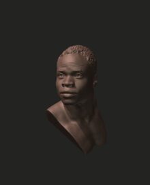
Reference 3D (2)


Reference Images (10)


Free to try
-
1. Lesson Overview
55sNow playing...
Watch the whole lesson with a subscription
-
2. Lecture: Basics of Shape Design
48m 41s -
3. Demonstration: Carlotta
30m 29s -
4. Demonstration: Mongo
21m 1s -
5. Your Assignment and Steve's Turn
15m 45s -
6. Lecture: Stability, Instability, and Action
9m 30s -
7. Demonstration: Lilias and Rajiv
30m 59s

