 UPDATE! October 1st, 2023: This version of the website will no longer receive updates. Please transition to the new website for the best experience.
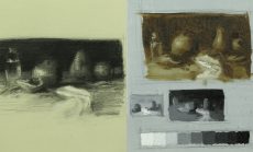
In week one, Juliette Aristides introduces the foundational concepts of working in the atelier method, beginning with a still-life composition. You will learn how to make a preparatory charcoal sketch, value studies in oils, and an initial drawing for a larger still-life painting.

In week two, Juliette Aristides will delve into the process of completing a color still-life painting, beginning with the underpainting as a unified base to tie your artwork together. You will learn how to carefully build up tones, working from large to small shapes, while maintaining the integrity of your composition.
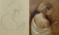
In week three, you will learn how to begin a figure painting in oil, through a value poster study, charcoal line drawing, and underpainting. Juliette Aristides will start the lesson with a poster study, focusing on simple values to create a compelling composition.

In week four, Juliette Aristides guides you in refining a figure painting by focusing on values, color temperature, and form. Juliette will work with contrast and a realistic approach to the skin tones of the figure through careful observation of light and shadow transitions.
Common Questions
This course is appropriate for intermediate and advanced levels.
This course includes downloadable assignment PDFs, that help you practice the materials taught by instructor Juliette Aristides. Keeping up with these assignments will maximize your learning outcomes.
A material PDF list is linked in each lesson under the description. Please check the file to see what you need to prepare.
Most New Masters Academy courses are designed to be done traditionally or digitally. Software changes constantly, but the fundamentals stay the same. It will be up to you to translate the information that you are learning to your software of choice.