 UPDATE! October 1st, 2023: This version of the website will no longer receive updates. Please transition to the new website for the best experience.
- Lesson Details
- References
- Assignments
In week four, you will learn how to edit photo references for drawing and painting. Instructor Chris Legaspi goes over the selection tool, transform tool, adjustment layers, and much more. After mastering this skill, you can regularly work from high-quality references, which will make your creative process more efficient.
Throughout this course, you’ll have access to the NMA community for feedback and critiques to improve your work as you progress.
Beginner Friendly
2093 views
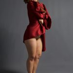
Reference Images (7)


This lesson has 3D Models reference. Subscribe now
This lesson has Assignments. Subscribe now
Free to try
-
1. Lesson Overview
34sNow playing...
Watch the whole lesson with a subscription
-
2. Course Alert
24s -
3. Learning Recommendation
24s -
4. Selection Tool and Grouping Layers
35m 40s -
5. Transform Tool
23m 16s -
6. Levels, Hue/Saturation, and Color Balance
32m 36s -
7. Creating Sharpness and Contrast
19m 13s -
8. Assignment
24s -
9. Assignment Demo
39m 18s

