 UPDATE! October 1st, 2023: This version of the website will no longer receive updates. Please transition to the new website for the best experience.

- Lesson Details
- References
- Assignments

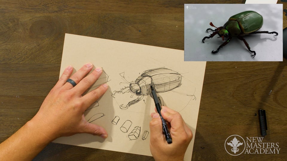
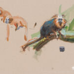
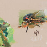
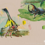
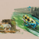
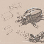
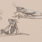
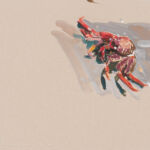
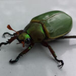
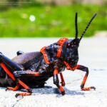
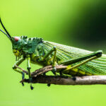
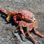
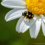
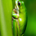
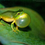
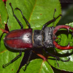
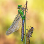
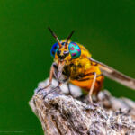
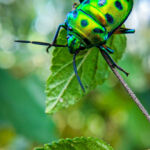
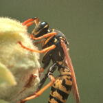
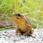
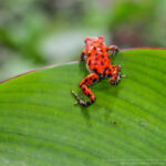
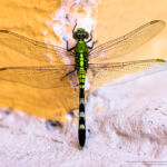
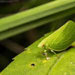
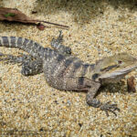
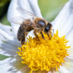
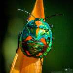
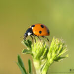
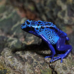
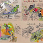
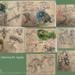
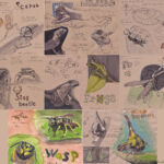
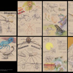
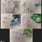
In this lesson, instructor Charles Hu will teach you how to create lay-in drawings of insects and tropical animals using a variety of drawing tools. Then, you will learn to sketch with color, specifically in gouache. Charles will show you how he loosely lays in the drawing, paints the overall color, and adds temperature shifts.
This lesson belongs to the course Visual Development: Dynamic Sketching. In this 12-week course, Charles Hu will teach you the core fundamentals of dynamic sketching. You will learn to focus on gesture, shape, and structure while drawing various subjects. Charles will first introduce you to the materials needed for the course and give you basic drawing exercises that will help strengthen your hands’ muscle memory. From there, you will learn to manipulate organic, geometric shapes and add surface details. Charles will demonstrate drawing animal skeletons, marine animals, insects, landscapes, cars, and many more. In addition, you will explore sketching in colors using gouache. After this course, you will develop an ability to break down any 3D subject into a 2D structure, and from there, draw with confidence.
Throughout this course, you’ll have access to the NMA community for feedback and critiques to improve your work as you progress.
You do not need to purchase specific materials to take this course.
We have included a materials list as recommendation only.
If you cannot find a specific material in your area, use the closest equivalent available to you.
Doing so will allow you to have the best possible learning outcome from this course.
For help with finding alternative materials, including how to take this course with digital tools,
please join our community Discord.

Reference Images (55)


This lesson has 3D Models reference. Subscribe now
Free to try
-
1. Learning Recommendation
24sNow playing... -
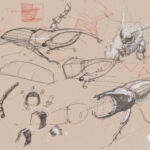
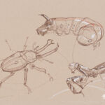
1. Drawing a Beetle
21m 56sNow playing...
Watch the whole lesson with a subscription
-
2. Drawing a Grasshopper, a Mantis, and a Lizard
35m 30s -
3. Learning Recommendation
24s -
4. Color Demonstration with Gouache
42m 58s -
5. Refining the Color Sketch Using an Artist Pen
8m 35s -
6. Assignment Instructions
1m 3s -
7. Assignment
24s


CONNECT
New Masters Academy
16182 Gothard St
Huntington Beach, CA 92647
Contact US