We’ve also included our Course Guide, with detailed information about every Learning Track, Module, and Course.
If you're serious about building skill, this is where you start: Download The NMA Catalog 2025
 Arm Study by Patrick Jones
All of our students are New Masters in training. Take Patrick Jones: He had already carved out a professional art career and was teaching full-time when he realized his foundations were full of gaps. So, for ten straight years, he spent every lunch break streaming New Masters Academy—tearing down weak spots and rebuilding his craft from the anatomy up. Today he mentors the next wave.
His story shows that mastery is earned, never gifted.
“My formal training came after a professional career,” Patrick reflects in a conversation with NMA founder Joshua Jacobo. “That’s when I filled in the holes. I went, ‘You’re not an impostor,’ you haven’t got a clue about anatomy at all… And the whole thing fell in like this—Boom!—and I feel that I have improved… a thousand percent, since having it from that ten years of New Masters Academy on my lunch breaks while I was teaching.”Watch the Full Interview
Animator and Educator, Disney, Marvel, Warner Bros.
Nickelodeon Character Designer, Illustrator, and Educator
Disney Art Director and Visual Development Expert
LCAD Foundations Instructor and Oil Painter
Movie Poster Illustrator, Braveheart, Total Recall, Home Alone
Author, Classical Drawing Atelier
Storyboard Artist for Major Studios
Former Principal Instructor, The Florence Academy of Art
Ringling Instructor, Award-Winning Portrait Artist


Julie Miette, an artist and YouTube creator based in Lyon, France, rediscovered her passion for fine art through New Masters Academy. After years as a designer, she immersed herself in foundational training, completing NMA’s rigorous Drawing Foundations module in 2024. Her work, influenced by Art Nouveau and the elegance of the late 19th century, explores ornamentation, the human figure, and botanical forms. Through her YouTube channel, Julie Miette Art, she documents her artistic journey, sharing insights and progress with thousands of viewers.
〝I'm really convinced now that studying the fundamentals is essential to really make the art I want to make.〞


As a professional digital artist, Tom Bernardes sought to expand his artistic range, embracing oil painting to deepen his understanding of form, light, and structure. Through New Masters Academy, he refined his craft across both digital and traditional media, strengthening his artistic foundation with structured training and expert guidance. His dedication and perseverance were recognized when he placed Top 3 in NMA’s Thrive and Persevere: The Artist’s Journey contest, with his work featured in the 2025 NMA Calendar and as a standalone poster.
〝I knew something was missing, but I couldn’t see it. Now, I’m not just fixing my weaknesses—I’m building something real.〞


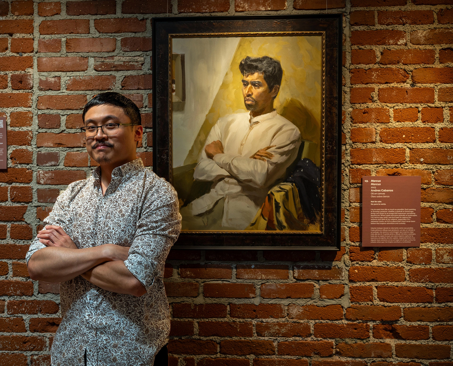
Andres Cabanos, one of Southern California’s '30 Under 30' artists at the Santa Paula Museum, credits New Masters Academy with transforming his technical abilities and artistic vision. His featured painting, Mark, inspired by the work of Joaquín Sorolla, showcases the 'alla prima' technique, a skill he honed at NMA through our rigorous study of master painters.
〝Because I spent my time to understand the basics, I can now focus on the jazz, creating and expressing myself with much more clarity and ease.〞
LIVE Seminar: Visual Expression with Charles Hu
Mastering 2025: Check-in #2
LIVE Seminar: Visual Expression with Charles Hu
Friday Draw Along with Glenn Vilppu
LIVE Seminar: Visual Expression with Charles Hu
Personalized Feedback & Mentorship to Accelerate Your Growth: Leveling up your art requires more than just watching lessons—it demands personalized feedback, structured guidance, and real accountability. With our Master Mentorship Program, you get direct, ongoing coaching from industry-leading mentors like Bill Perkins and Iliya Mirochnik, tailored study plans, and dedicated portfolio reviews.
Looking for more flexibility? NMA Tokens offer convenient, on-demand critiques, assignment feedback, and personalized advice whenever you need it.
Choose your path to mastery—structured mentorship or flexible tokens—and start seeing real progress today.
Summer Term Enrollment Ends August 31st, 2025
The following plans will additionally enroll you in the Summer Term 2025 Cohort, with access to a dedicated, private online community. Enrollment closes August 31, 2025. The Summer 2025 Cohort features:
Interactive live streams with the NMA team to keep your MasterPlan™ on track all year.
Traditional/Digital Workflows: A 3-hour live intensive with NMA Instructor Iliya Mirochnik this September.
Monthly group sessions with NMA's Cohort Liaison for tips on planning, process, and sticking with it.
Cohorts have their own private community space on the NMA Digital Campus, where you can share work, get feedback, and connect with fellow artists.
Gain instant access to our complete online course library, including all Learning Tracks and digital campus access.
Billed Annually
$441$330.75USD
Enroll Now$330.75 for your first year, then $441 per year after that. NMA Tokens are granted once, and will be delivered digitally within 3 days of enrollment. Cohort Planner printable will be available in the NMA Digital Campus before enrollment ends.
Plan renews automatically. Cancel any time.
Everything in the Library Plan, plus access to our exclusive reference library and Live Class recordings.
Billed Annually
$711$533.25USD
Enroll Now$533.25 for your first year, then $711 per year after that. NMA Tokens are granted once, and will be delivered digitally within 3 days of enrollment. Cohort Planner printable will be available in the NMA Digital Campus before enrollment ends.
Plan renews automatically. Cancel any time.
Give the gift of learning with NMA. Perfect for artists at any skill level!
Want feedback on your work? NMA Tokens allow you to get critiques, assignment grading, and one-on-one instruction from our world-class faculty, coaches, and TAs—on your terms.
Need help choosing a plan? Contact us for assistance.